Kusch+Co Showroom
A Stage for Good Design
Kusch+Co has been one of the internationally renowned manufacturers of high-quality seating for decades. The new showroom was not intended to communicate this ambition through elaborate decoration, but through architecture. The aim was to create a space that expressed the company’s openness, quality and international outlook.
When we first entered the existing industrial building, our eyes were immediately drawn upwards.
Hidden above the suspended ceiling was the building’s original steel structure.
At that moment, the most important design decision had already been made.
The ceiling had to go.
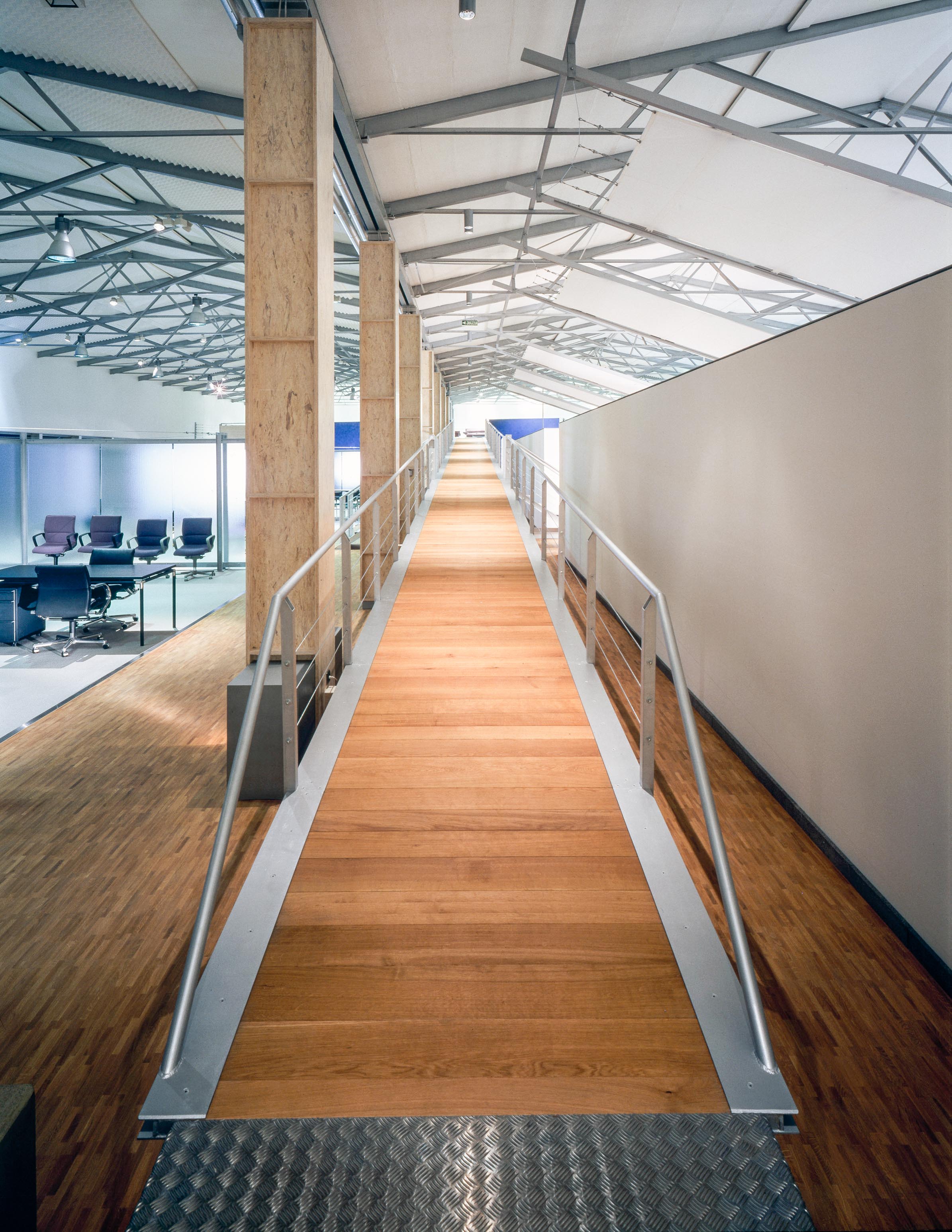
With a single intervention, the hall regained its original height. At the same time, the elegant steel structure became visible once again, creating enough space for an additional gallery with approximately 300 square metres of exhibition area.
Only then did the real design challenge begin.
How do you present several hundred chairs without simply placing them side by side?
The entire design therefore followed one guiding idea that shaped every detail of the project.
The exhibition became a stage.
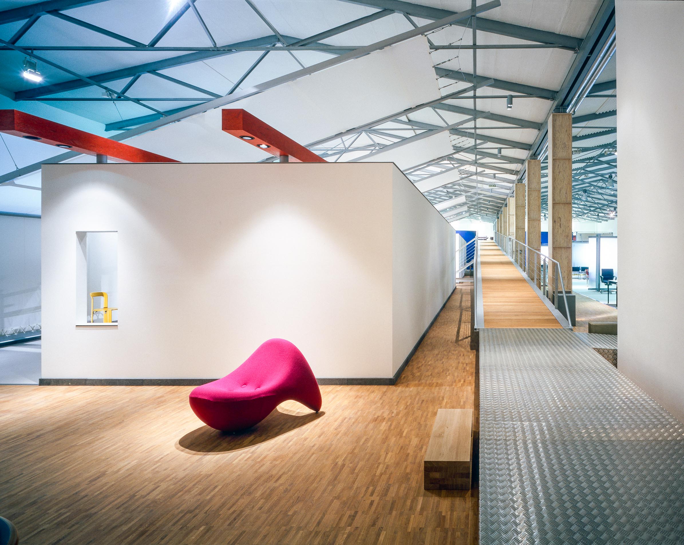
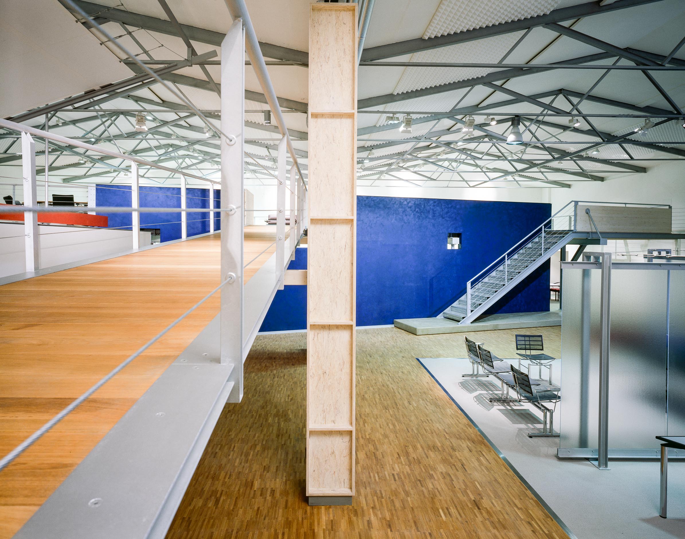
At the centre of the building, a long ramp connects the ground floor with the gallery while continuously changing the visitor’s perspective. At ground level, individual furniture settings take centre stage. As visitors ascend, larger spatial relationships become apparent. Only from the gallery does the company’s complete product range reveal itself.
The intention was never to provide the fastest possible overview.
The journey itself is part of the exhibition.
Every new position creates different relationships between furniture, architecture and the surrounding display areas. Products that initially appeared as individual objects become part of a larger composition, while others move into focus. The exhibition changes with the movement of the visitor.
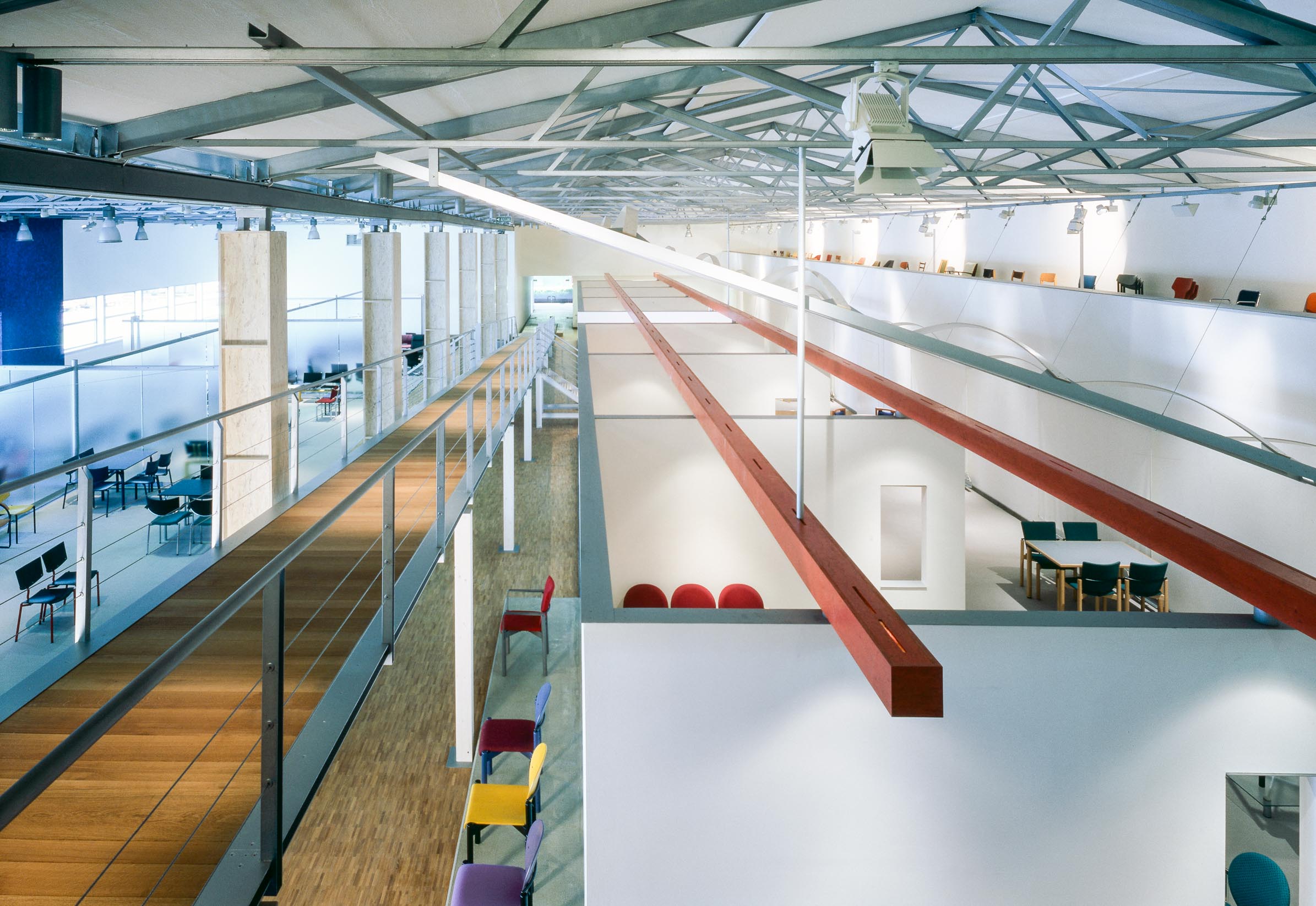
To the left of the gallery walkway, furniture for cultural and healthcare environments is presented within abstract white house-like volumes formed by a few boldly proportioned walls. Opposite, office collections are displayed within an open steel-and-glass structure. The two exhibition areas deliberately employ different architectural languages while remaining part of one coherent concept.
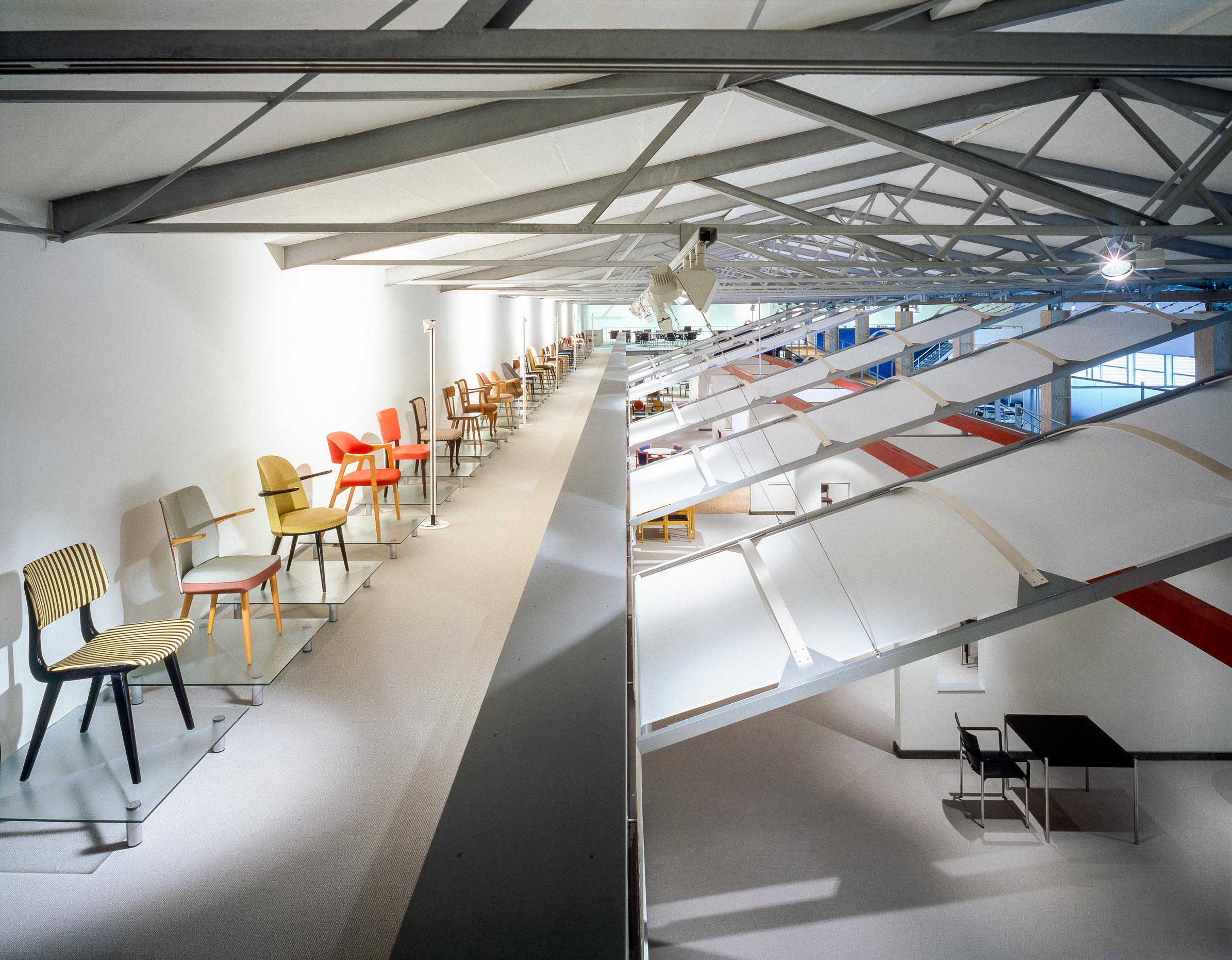
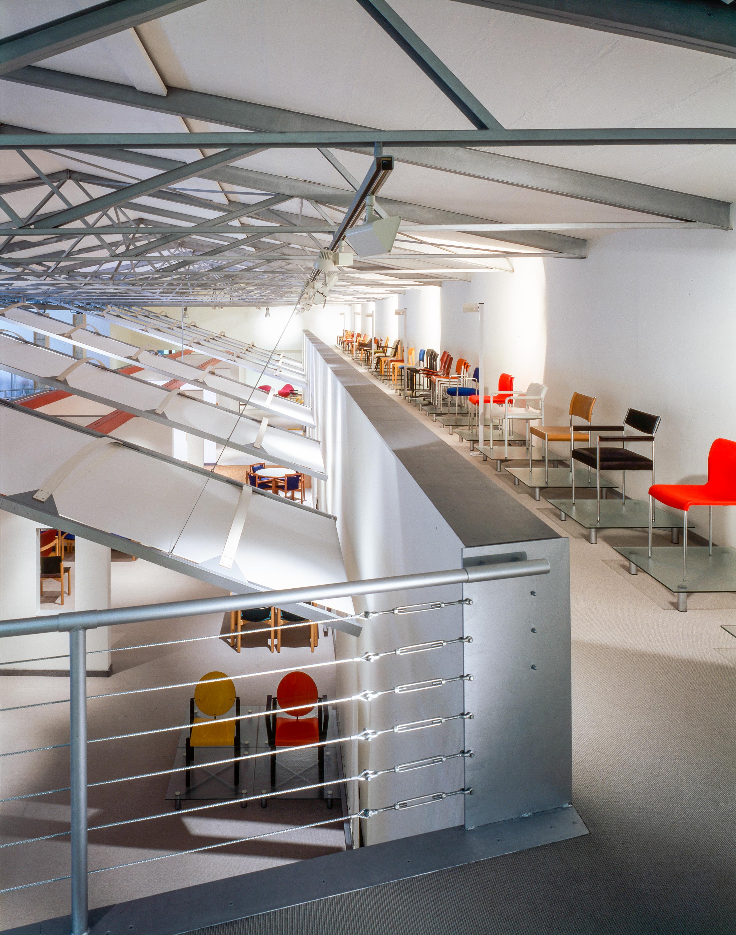
The choice of materials follows the same philosophy. Exposed steel, glass, timber, concrete and textile sails remain true to their original character. Nothing is concealed or decorative. Every material explains its own construction. Deep blue walls and two orange bands of light introduce carefully placed accents, bringing tension to the restrained palette without competing with the furniture.
Light also plays a crucial role. Daylight is drawn deep into the building through translucent glass structures. Large textile sails create soft ambient illumination, while directional luminaires emphasise individual products. As on a theatre stage, lighting determines which areas command attention and which deliberately recede into the background.
In 1997, the showroom received the Second Prize of the German Interior Architecture Award. The jury honoured a design that does not decorate products but turns their presentation itself into architecture.
Almost three decades later, the building continues to serve as Kusch+Co’s showroom. While the collections have evolved, the architecture still provides the framework for presenting them.
Further Information
Project Details
- Project: Kusch+Co Showroom
- Location: Gundringhausen 5, 59969 Hallenberg, Germany
- Client: Dieter Kusch
- Completion: 1997
- Services: Interior architecture, exhibition design
- Award: Second Prize, German Interior Architecture Award 1997
Progress often begins with a simple question: Could this be done differently?
Should you wish to discuss your own project, we would be delighted to hear from you.
Phone: 02151 736005
Email: k.buerger@k-buerger.de