Behring Pharmacy
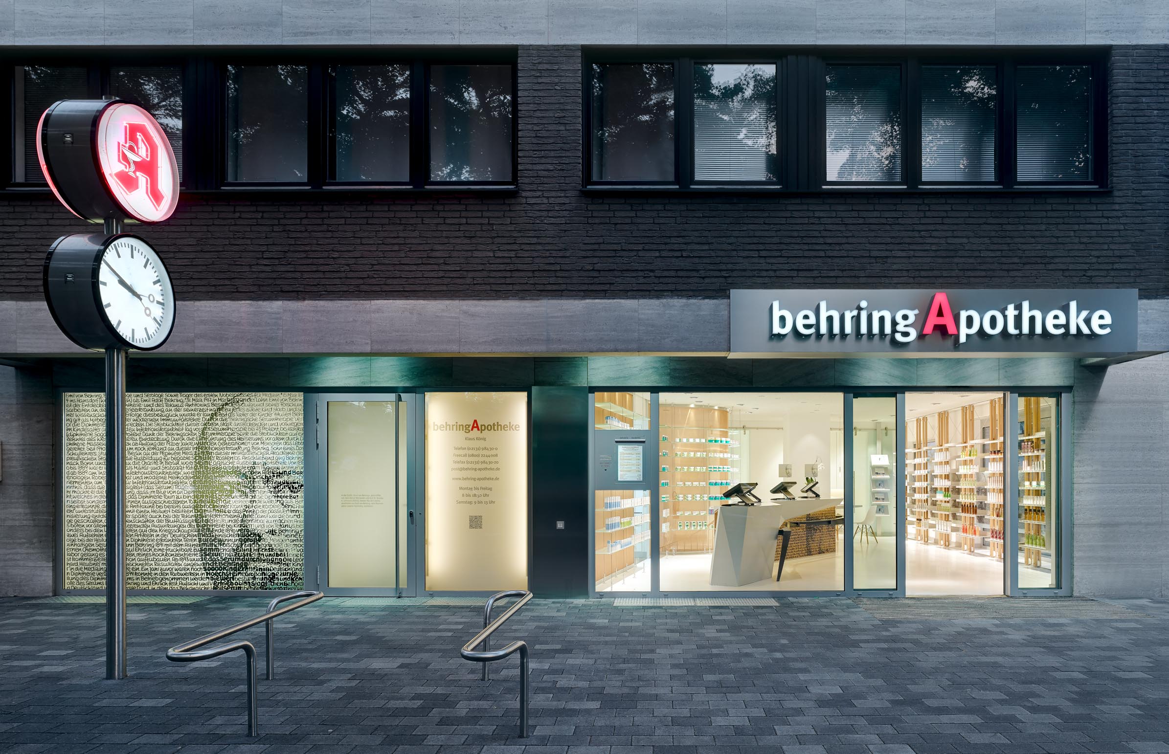
When the opportunity arose to acquire the neighbouring retail unit and expand Behring Pharmacy to almost 240 square metres, it quickly became clear that the new corner location, with its shop windows and direct relationship to the customer car park, should become the new face of the pharmacy.
The pharmacy was meant to be visible.
“But please, not as though it were designed for old people.”
That was one of the first wishes expressed by Klaus and his wife König. Both were already in their sixties at the time, yet they wanted a pharmacy associated with new beginnings rather than retirement.
They used this rare opportunity not merely to enlarge the pharmacy but to rethink it completely. This was not intended as a cautious modernisation using the existing furniture. The new pharmacy was meant to express how they saw themselves: open, contemporary and enthusiastic about new ideas.
The new corner unit, however, brought not only additional space but also several challenges. A large spiral staircase leading to the basement and several service and chimney shafts stood directly in the middle of the room. At the same time, this was where the new dispensary had to be created—the area perceived by customers, where advice, sales and communication take place.
The additional floor area therefore did not solve the problems automatically. Quite the opposite. The new corner location had to accommodate a dispensary that felt spacious, provided sufficient room for customers and met all the requirements of daily operation.
Neither the staircase nor the shaft could be removed or relocated.
We therefore had to find a way to integrate both into the pharmacy. This ultimately determined the form of the prescription counter. It maintains the necessary distance from the staircase, incorporates the shaft and continues towards the consultation area at the rear of the dispensary. At the same time, it organises movement throughout the sales space. What appears entirely natural today emerged from the attempt to reconcile as many requirements as possible within just 37 square metres.
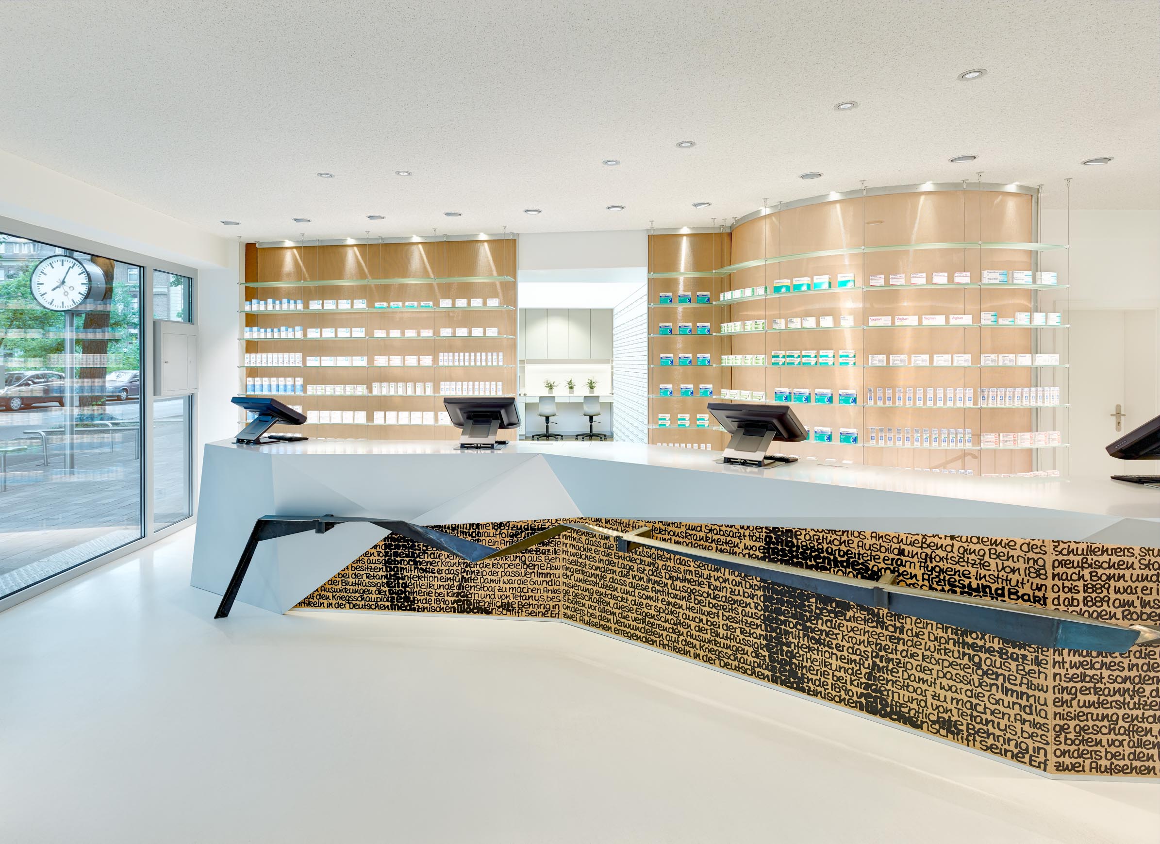
Anyone entering the pharmacy is initially unaware of these constraints. The large spiral staircase disappears behind the medicine display. Circulation is generous. The space feels open and effortless.
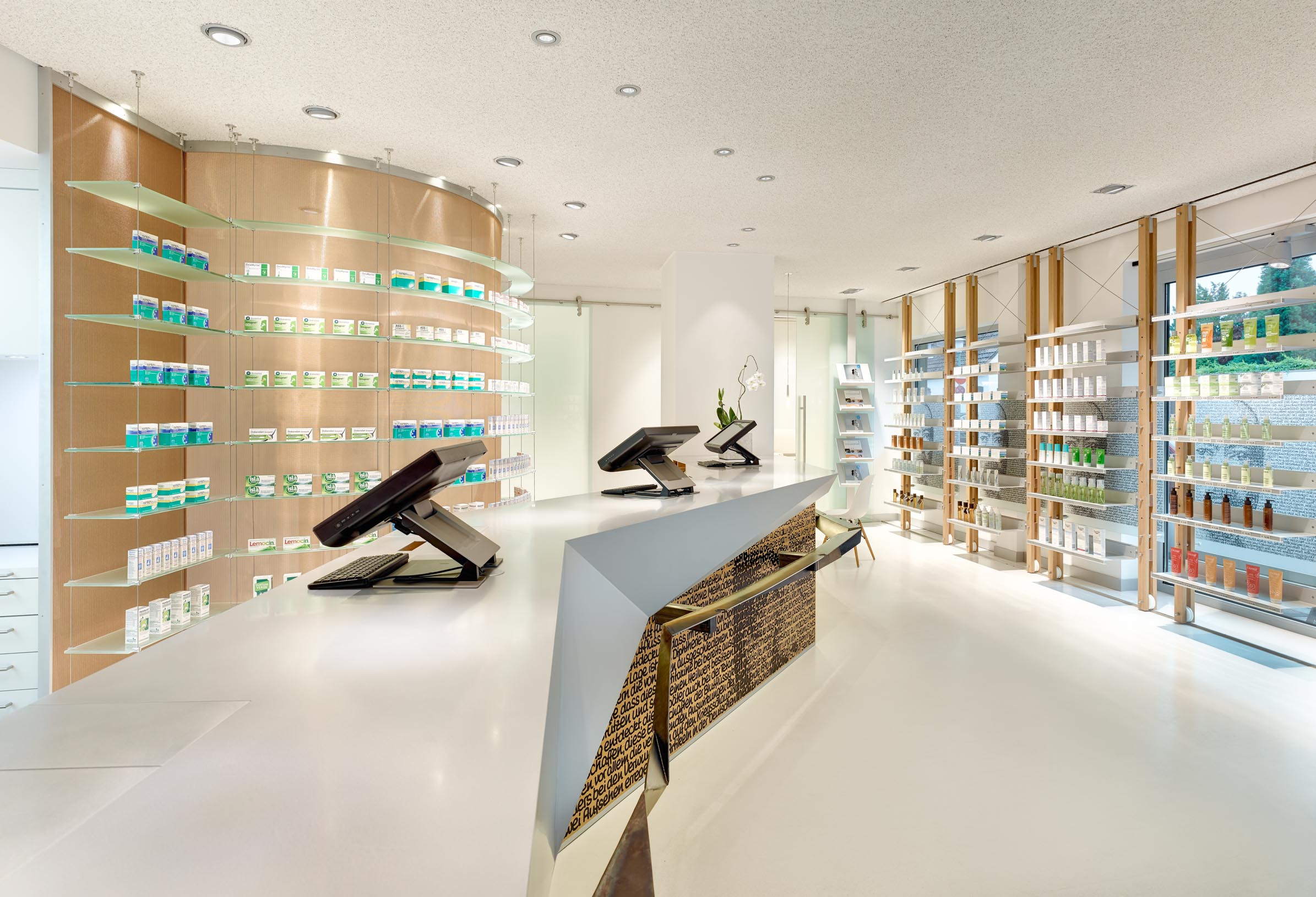
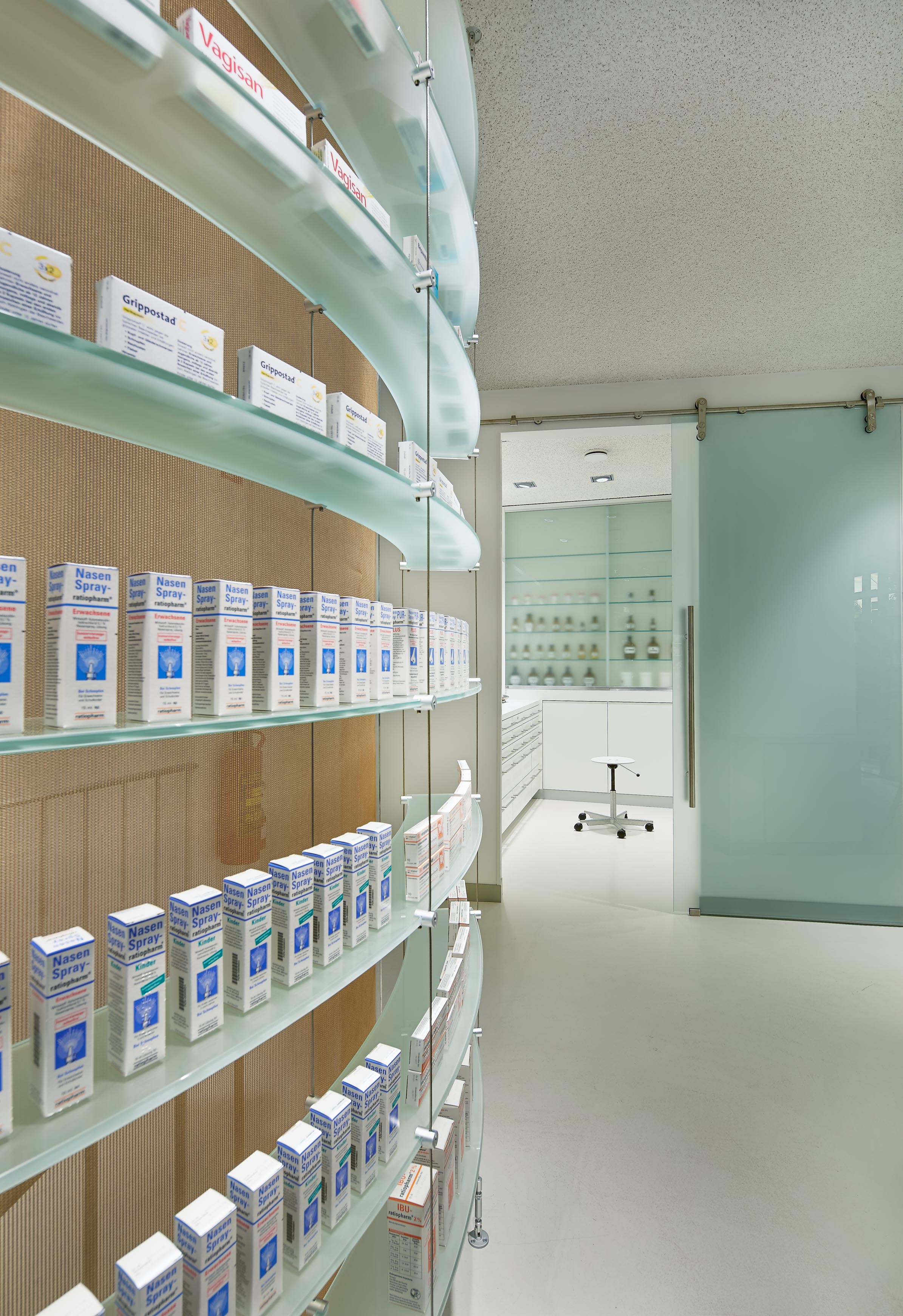
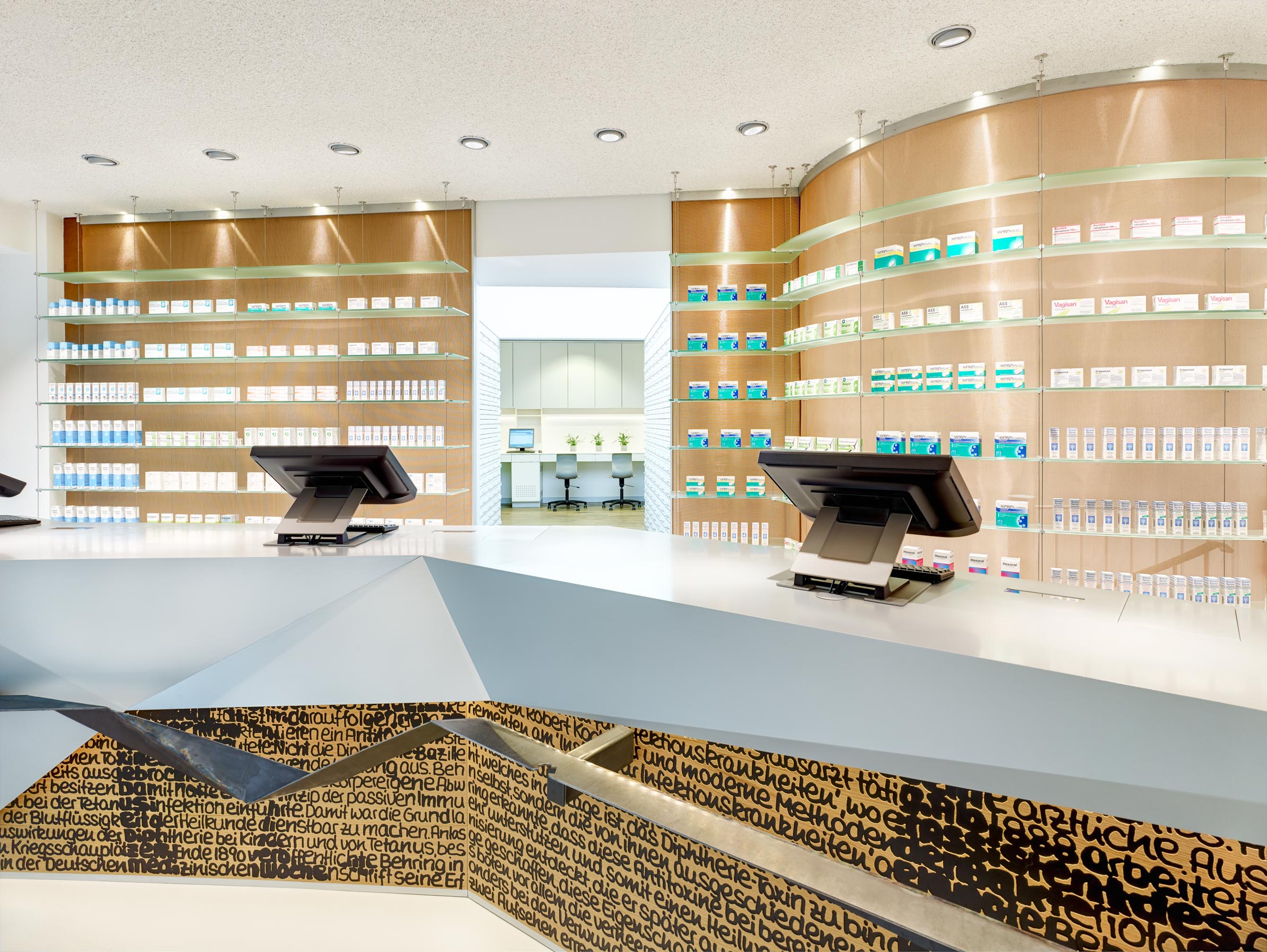
The medicine display consists of glass shelves set against an enclosure of bronze metal mesh. The material could follow the curve of the staircase enclosure while preserving the transparency of the room. Instead of dividing the sales area, it allows views across the entire dispensary. In the grazing light of the integrated LEDs, the mesh develops a warm shimmer and creates a deliberate contrast to the more technical elements of the design.
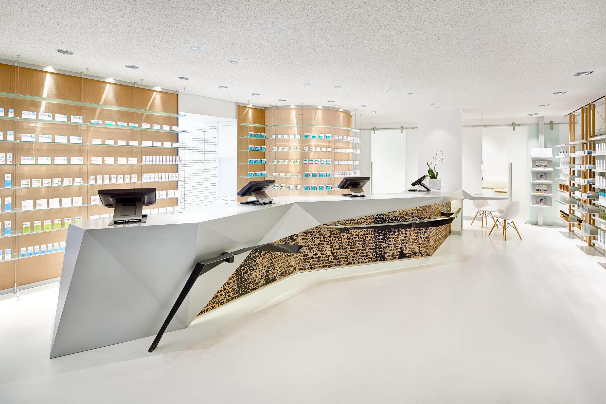
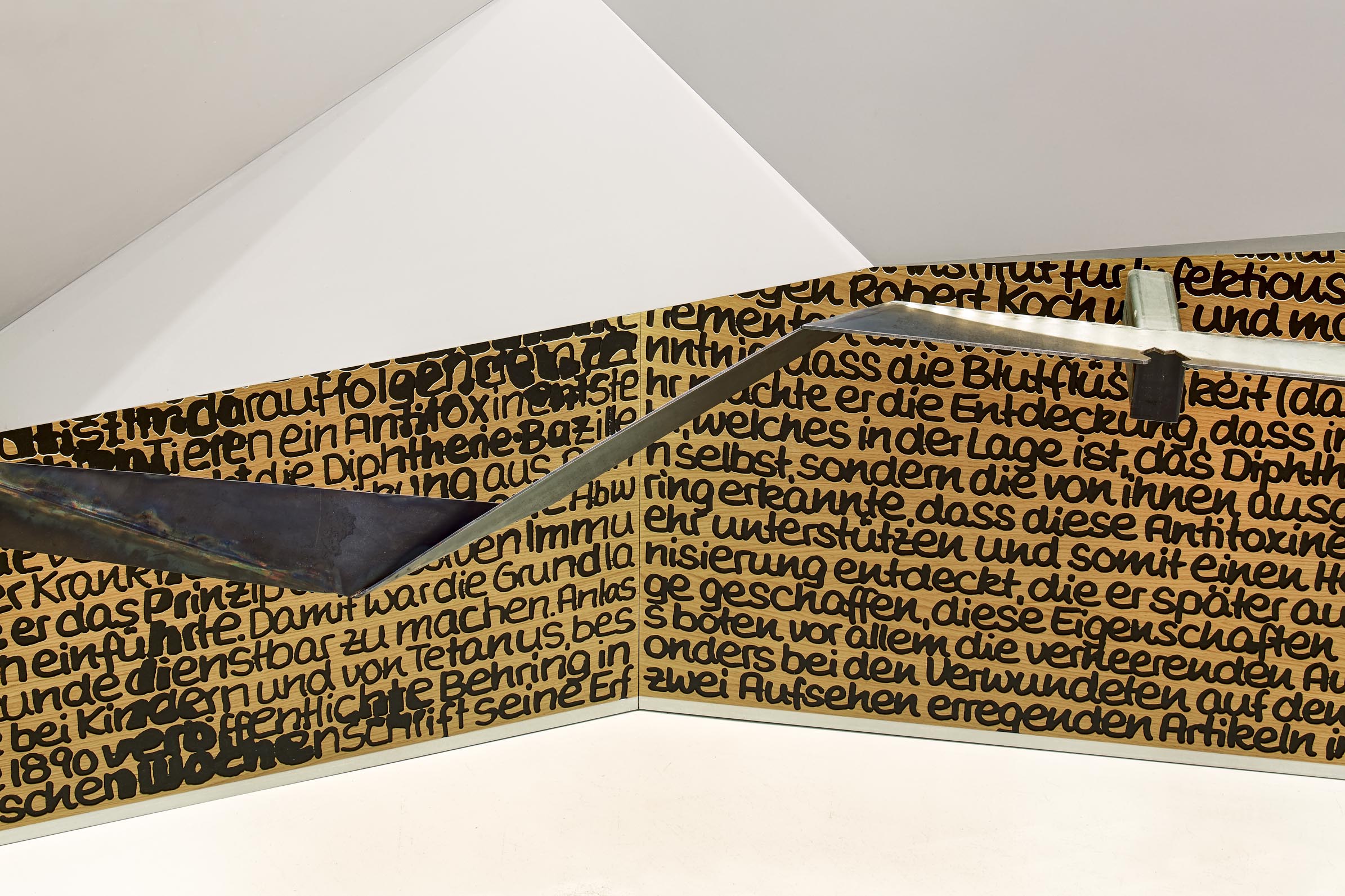
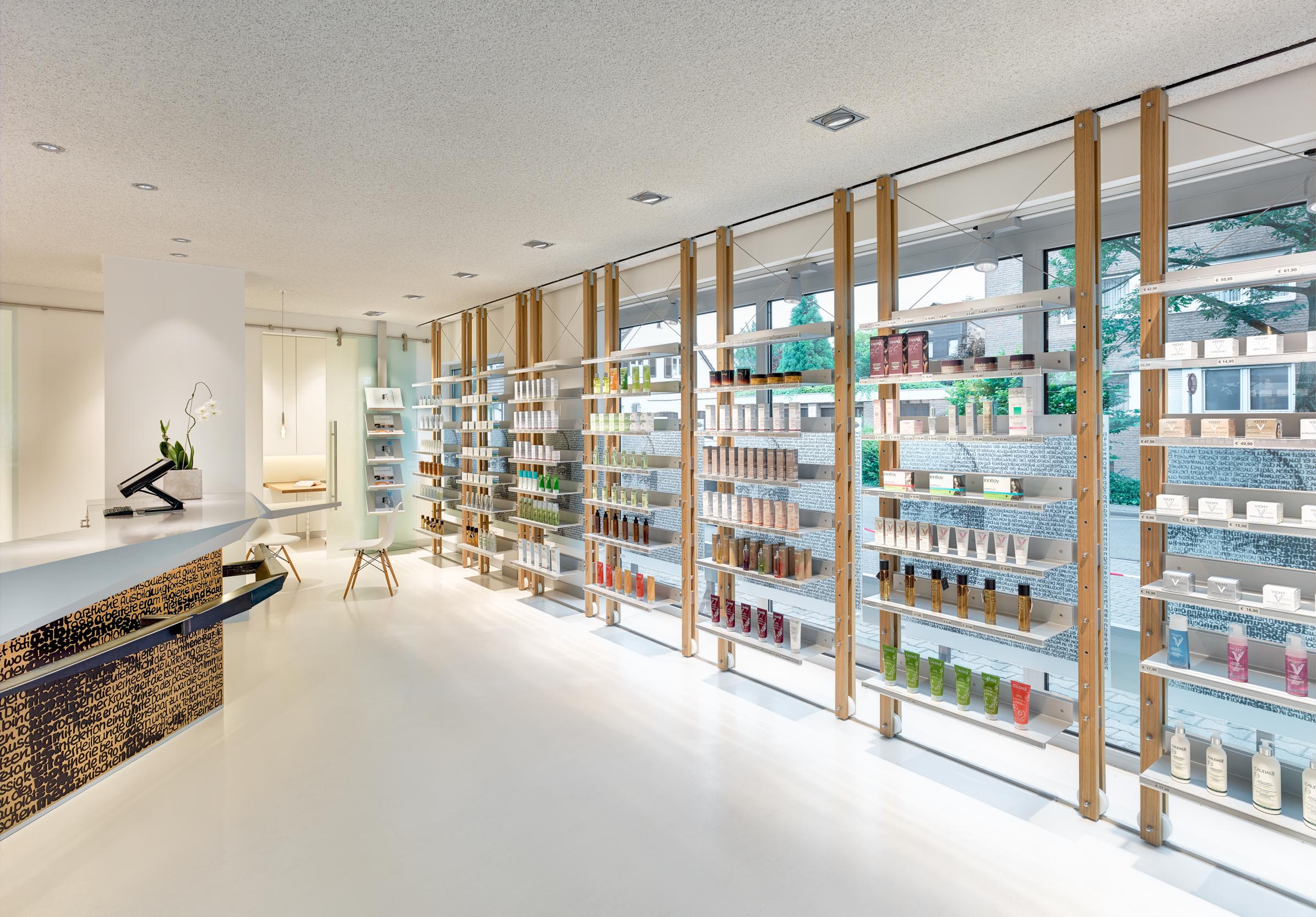
This applies particularly to the prescription counter. Its faceted form follows the geometry of the room and was developed entirely in three dimensions. The aluminium surface gives it a technical precision that contrasts distinctly with the warm materiality of the bronze mesh.
Before final production, the counter was constructed at full scale on site. Only then could we verify whether the planned circulation spaces would actually work. We walked around the counter, adjusted distances and corrected details until everything fitted.
The pharmacy is named after Nobel Prize laureate Emil von Behring. This created an unexpected problem: who exactly was this man?
To be honest, I first had to look him up myself. My initial association was with the Bering Sea rather than the founder of modern serum therapy.
We found the solution almost by chance when we came across the work of Cologne-based physician and word painter Dr Sascha A. Lehmann, known as SAXA. His typographic portraits combine image and biography in an unusual way. It was exactly what we had been looking for.
Emil von Behring thus became part of the design. This is particularly visible on the prescription counter. A graphic combining the portrait and life story of the pharmacy’s namesake was milled into the oak front. LED edge lighting further accentuates the structure.
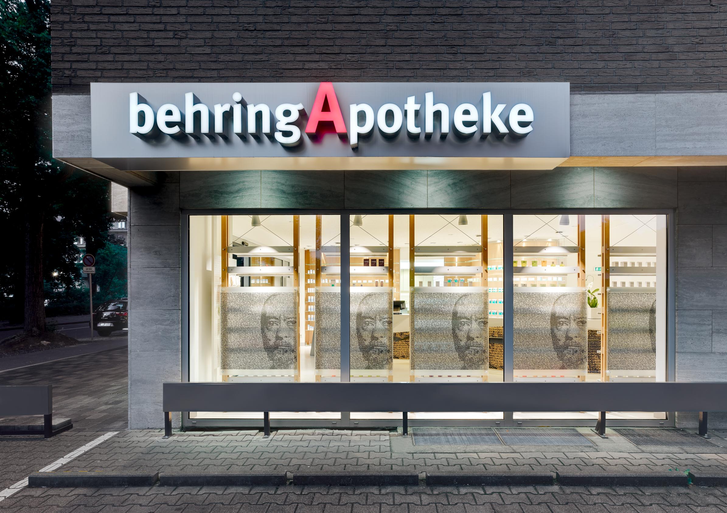
The motif reappears at several points throughout the pharmacy. The mobile self-service display units in the shop windows also take up the theme. The graphic appears again on their satin-finished glass rear panels, creating a connection between interior and exterior.
Visitors approaching the pharmacy from the car park first encounter Emil von Behring while simultaneously gaining an initial view into the dispensary. Conversely, the sales space benefits from daylight, transparency and visual connections to the outside. The shop windows therefore serve not only for product presentation but become part of the spatial concept.
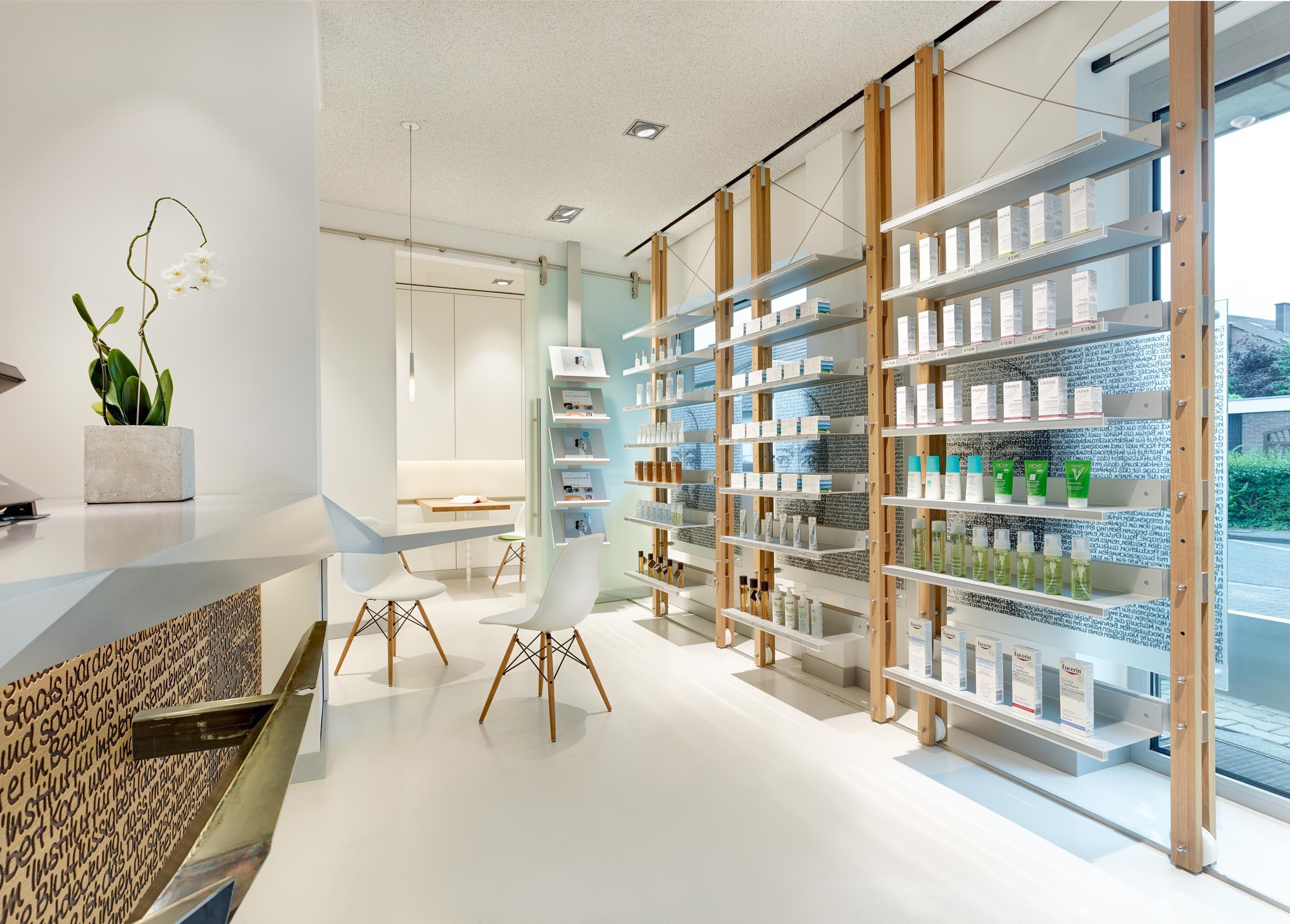
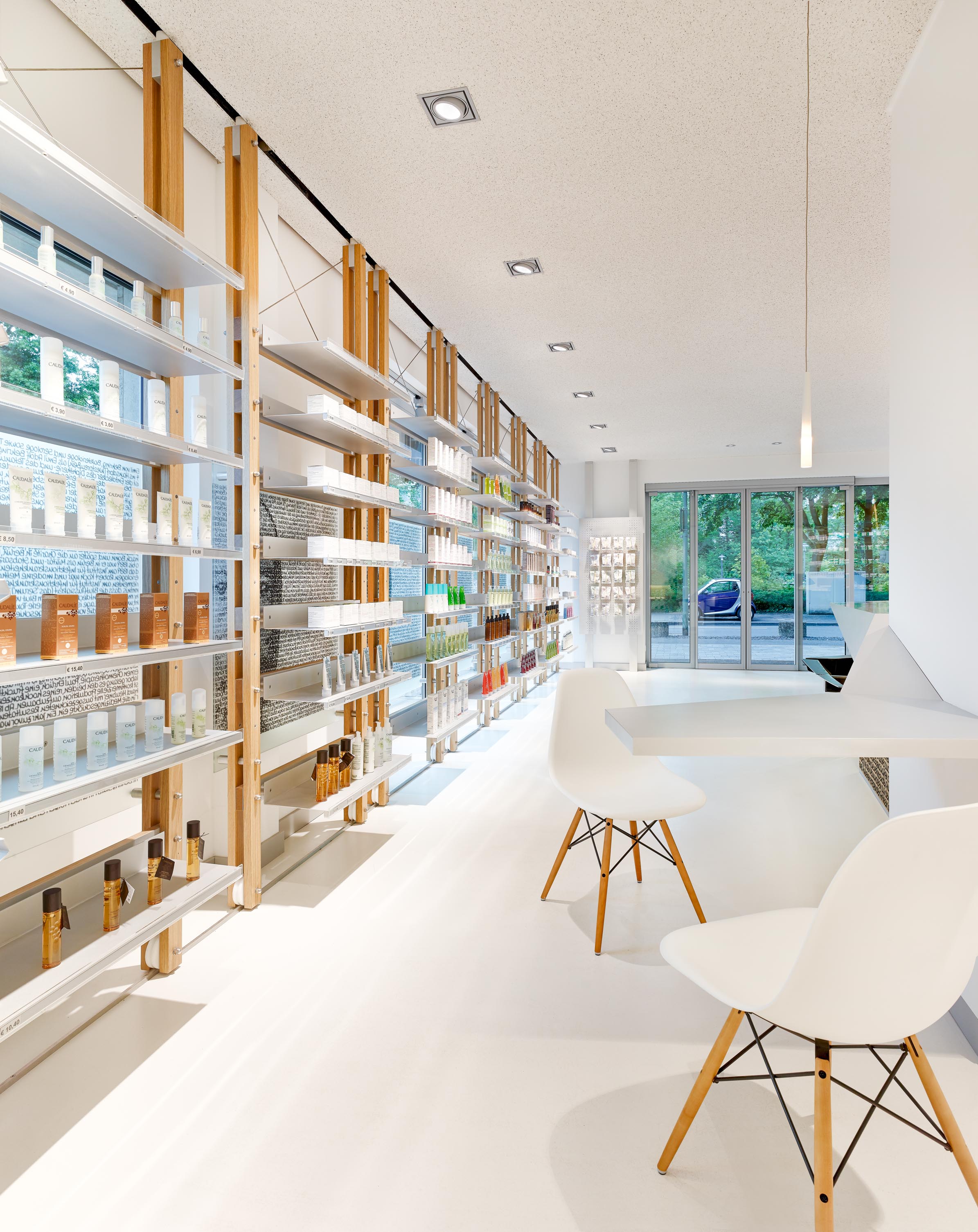
The consultation area and compounding laboratory are located at the rear of the dispensary.
Lighting was not treated as an addition introduced at the end of the project. The edge lighting of the prescription counter makes the milled Behring graphic visible in the first place. Small LED spotlights make the bronze mesh shimmer and emphasise its metallic character. Carefully positioned pools of light above the service positions mark the places where consultation takes place.
A passage to the working area opens in the centre of the medicine display. Between the drawer columns, a tunnel-like space is created and evenly illuminated by a continuous luminous ceiling. The glare-free light facilitates daily work while giving the transition an unexpected sense of generosity.
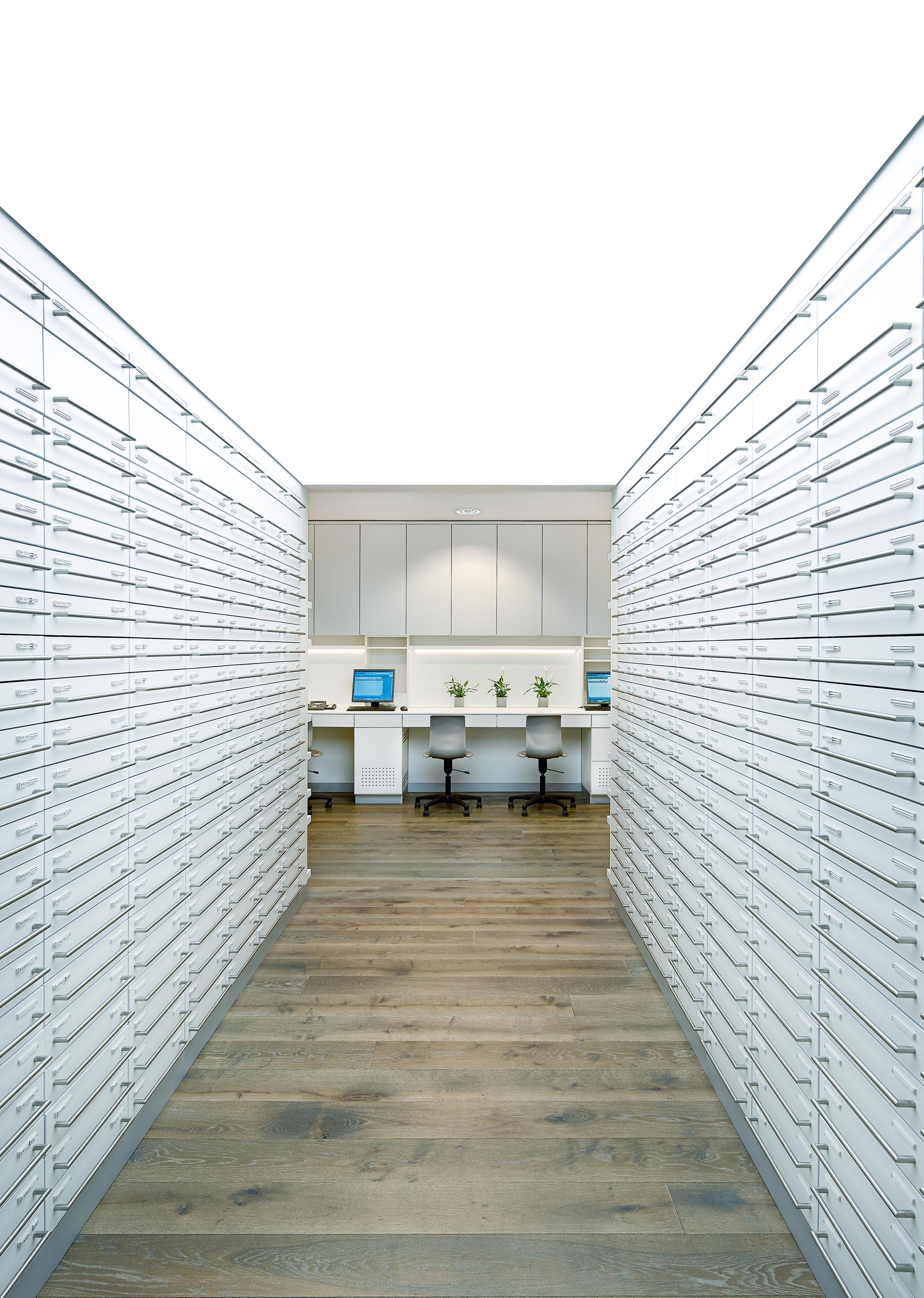
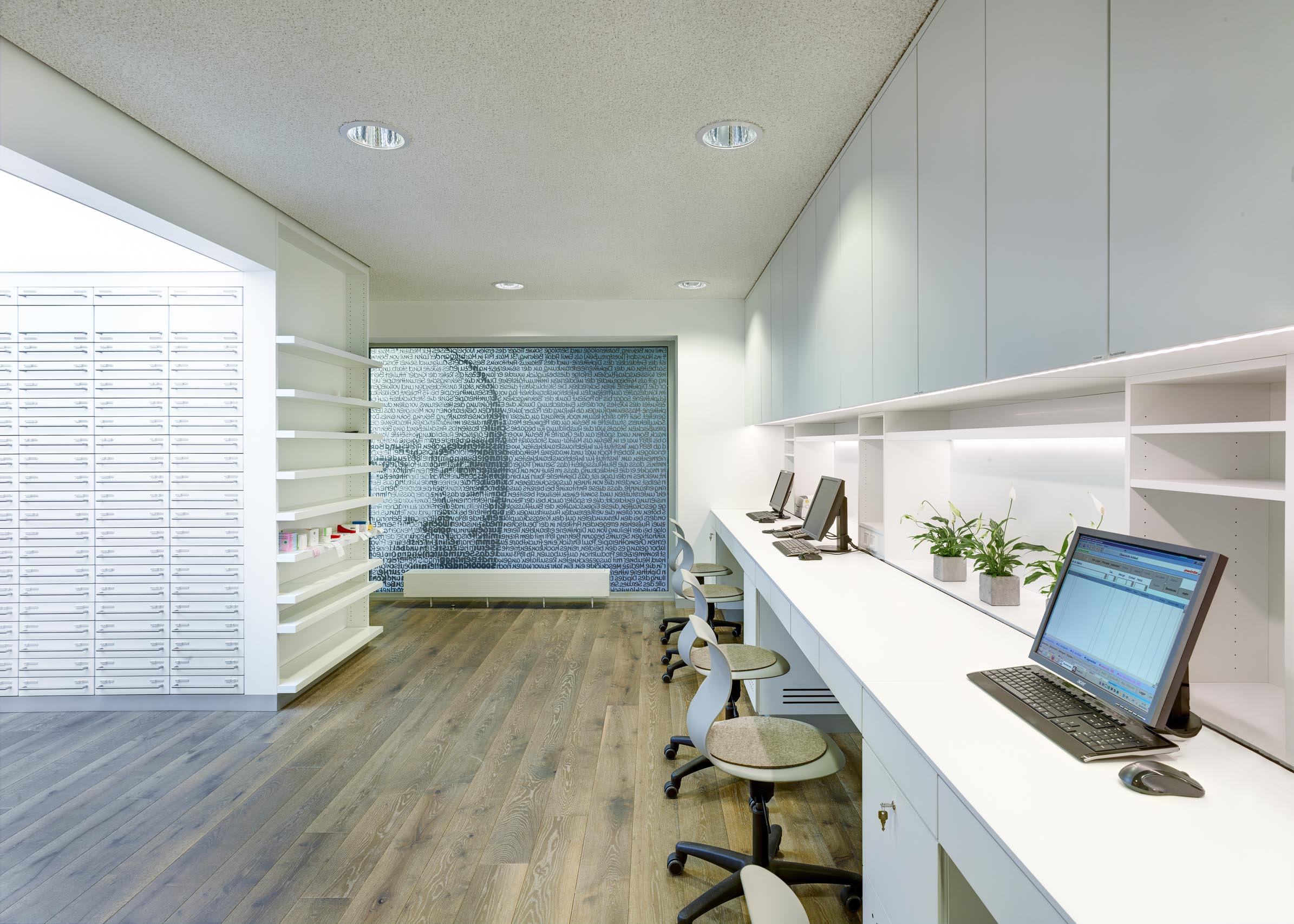
The material palette changes in the working area. While the dispensary is characterised by a white seamless cast floor, bronze, aluminium and glass, rustic oak floorboards and white built-in furniture define the rear section.
The oak boards were deliberately selected with planed, smoked and aged surfaces. Their lively finish can absorb signs of use and age gracefully. After all, goods crates, mobile containers and office chairs are moved across them every day. At the same time, the light-coloured furniture creates calm, order and optimal working conditions.
Behring Pharmacy did not emerge from a single formal idea but from a series of highly specific requirements. A rare opportunity for expansion, a difficult existing building structure, the owner’s operational needs and the clients’ desire for a contemporary pharmacy all had to be brought together as a coherent whole.
Further information
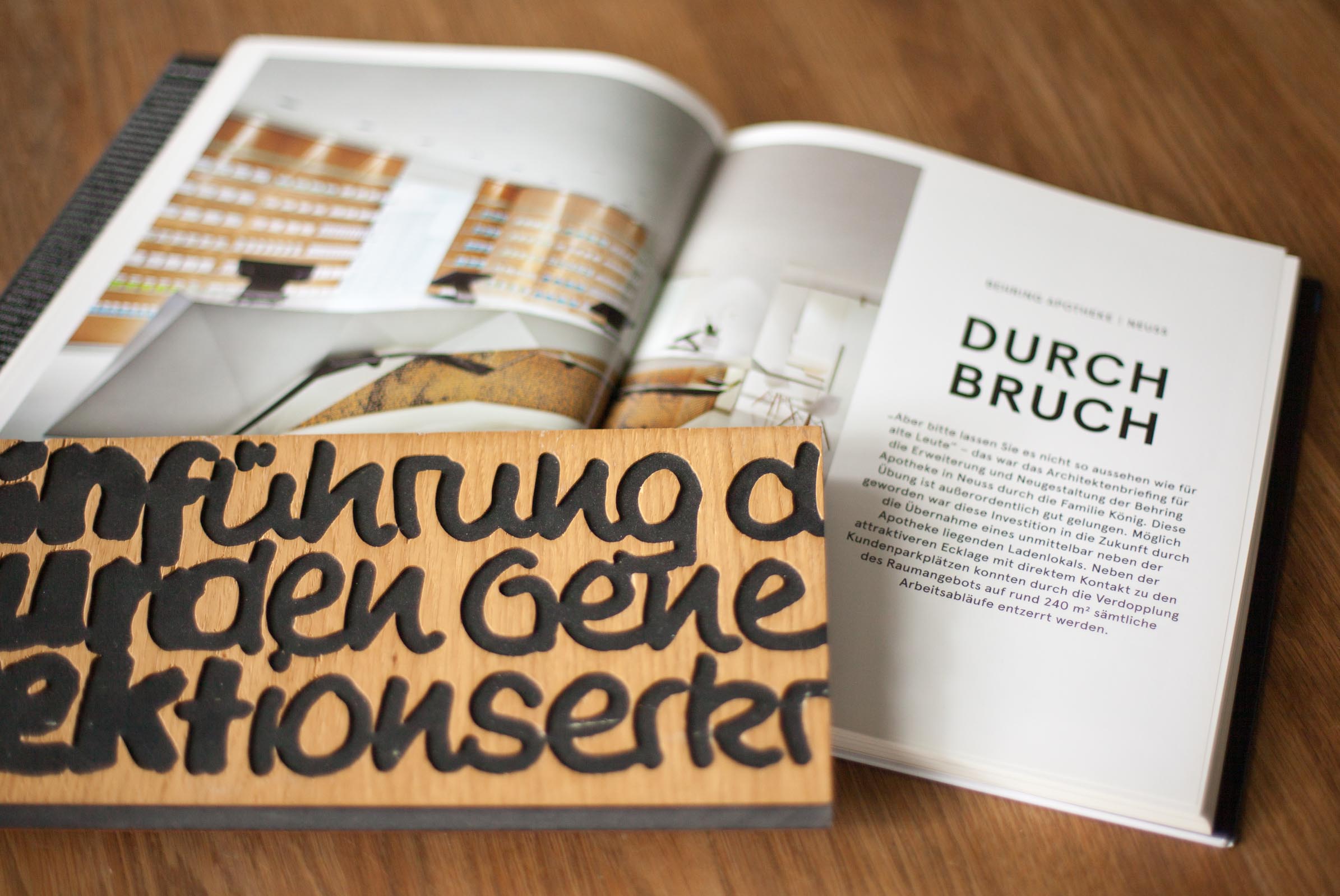
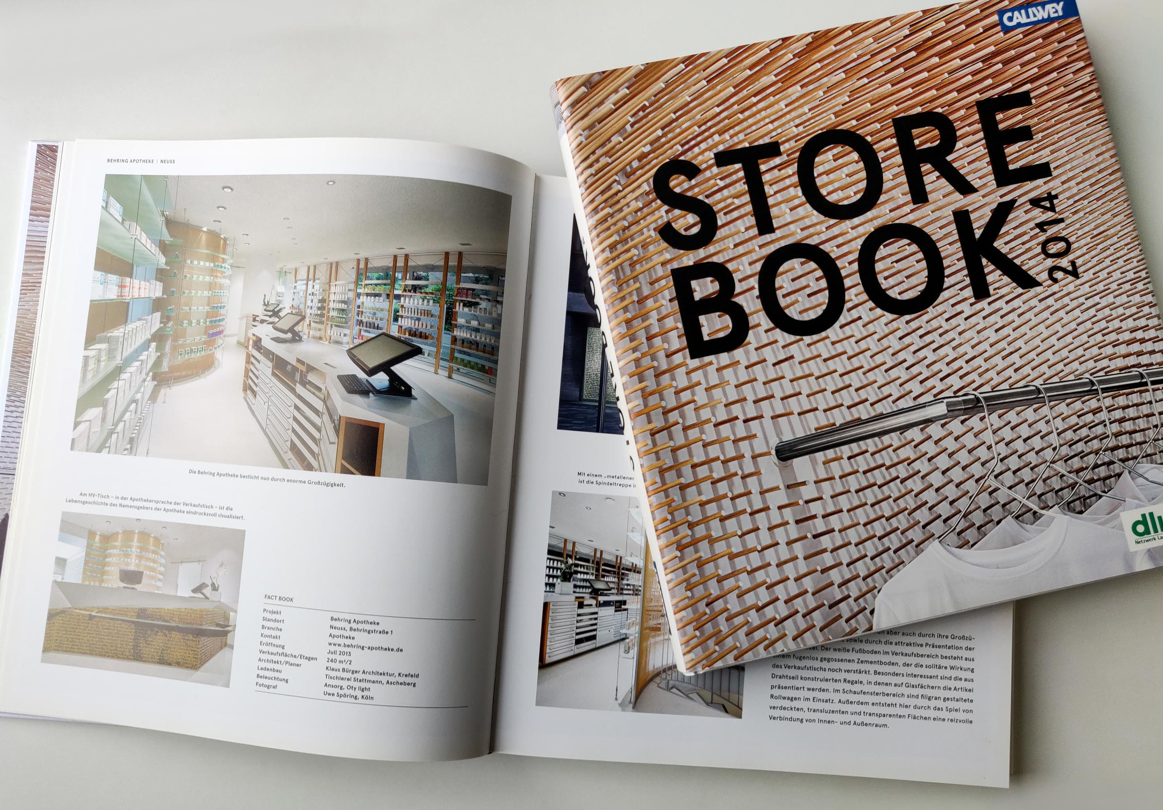
- STORE BOOK 2014
- Instagram – Part 1
- Instagram – Part 2
- Instagram – Part 3
- Instagram – Part 4
- Instagram – Part 5
More projects, detailed photographs and references relating to pharmacy design can be found on our Pinterest board:
Pinterest board “Pharmacy Design”
Publication
Project details
- Project: Behring Pharmacy
- Location: Neuss
- Address: Behringstraße 1, 41464 Neuss, Germany
- Completion: 2013
- Total area: 240 m²
- Client: Klaus König
- Successor since 2020: Margarita Terjung
- Services: Interior architecture and pharmacy planning
- Special features: Extension into the neighbouring retail unit, dispensary incorporating a spiral staircase, bronze metal mesh, aluminium prescription counter, SAXA graphic and luminous ceiling in the working area
We do not plan pharmacies. We create one-of-a-kind spaces.
Every project has its own story, its own requirements and its own personality. That is why we do not believe in standard solutions.
Should you wish to discuss your own project, we would be delighted to hear from you.
Phone: 02151 736005
Email: k.buerger@k-buerger.de