Marien Pharmacy
Marien Pharmacy in Aldenhoven is one of those projects where the architectural challenge initially appears straightforward – yet becomes increasingly fascinating on closer inspection. Two entrances, two previously separate sales areas, a shared working zone between them, and a building ensemble consisting of the pharmacy, the owners’ apartment and an adjoining medical practice all had to be transformed into a single coherent pharmacy.
Three Buildings – One Unified Identity
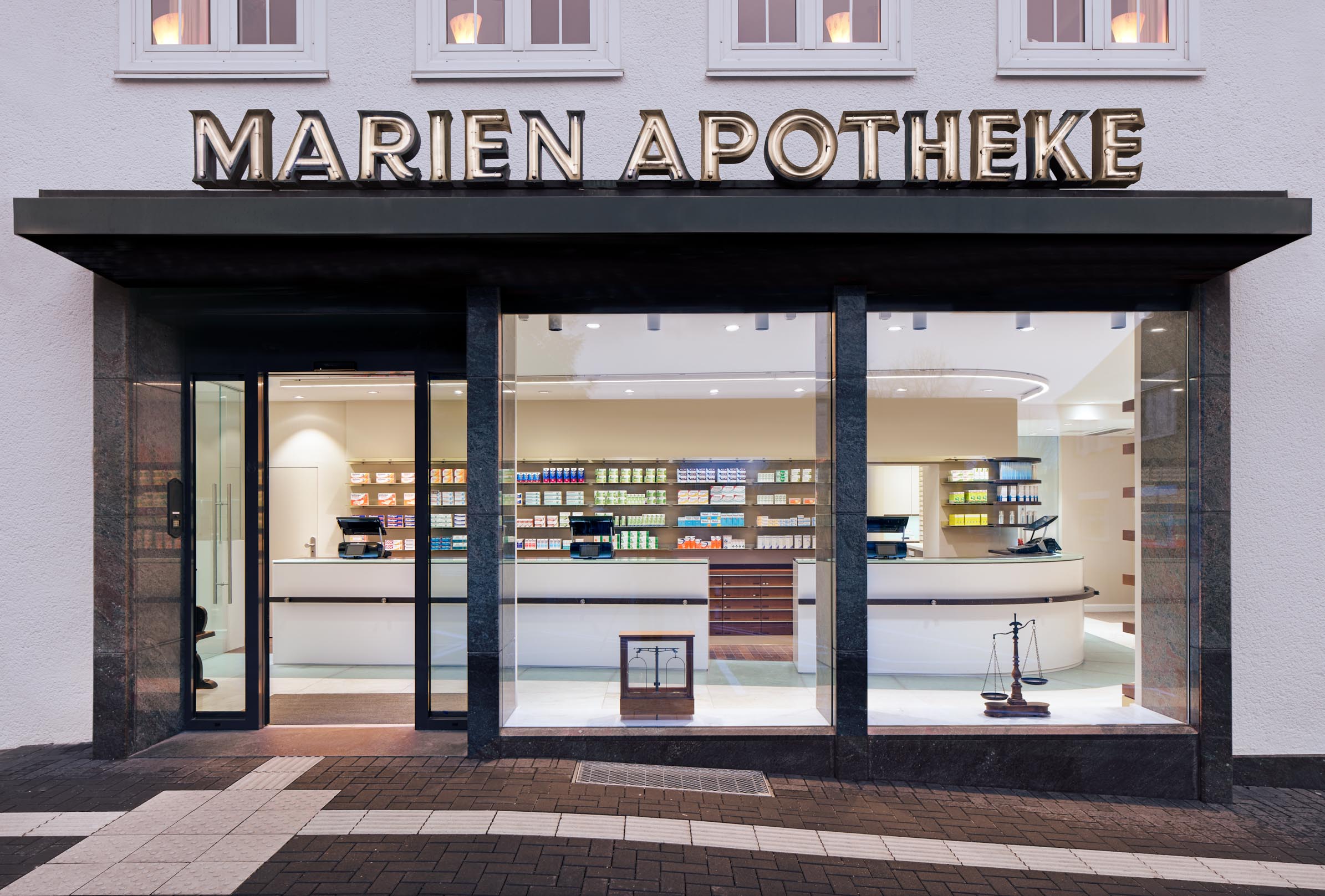
Marien Pharmacy occupies the pointed corner of a road junction with five customer parking spaces directly in front. Three different building elements meet here: the pharmacy itself, the owners’ apartment in the corner building and a newer wing housing a joint internal medicine and general practice.
The pharmacy opens towards the parking area with its generous shopfront and main entrance. As part of the refurbishment, the entire forecourt was redesigned. The entrance area was gently raised, eliminating the former step. Tactile paving now improves accessibility and guides visually impaired visitors safely to the entrance. Towards the edges, the paving returns to street level to ensure convenient access to the parking spaces.
The medical practice is connected to the pharmacy building by a glazed stair tower, which also provides the secondary entrance to the dispensary.
Two Separate Pharmacies Become One
Before the refurbishment, the two entrances were not connected internally. Each led into its own sales area, separated by the shared working area with the general alphabet.
The objective was to create a new dispensary equally accessible from both entrances and experienced as one continuous space rather than two separate pharmacies.
Part of the adjoining residential building was therefore incorporated into the pharmacy. Workstations and drawer columns were relocated into this newly assigned area, allowing the previously divided layout to become one coherent dispensary.
Following the Curve
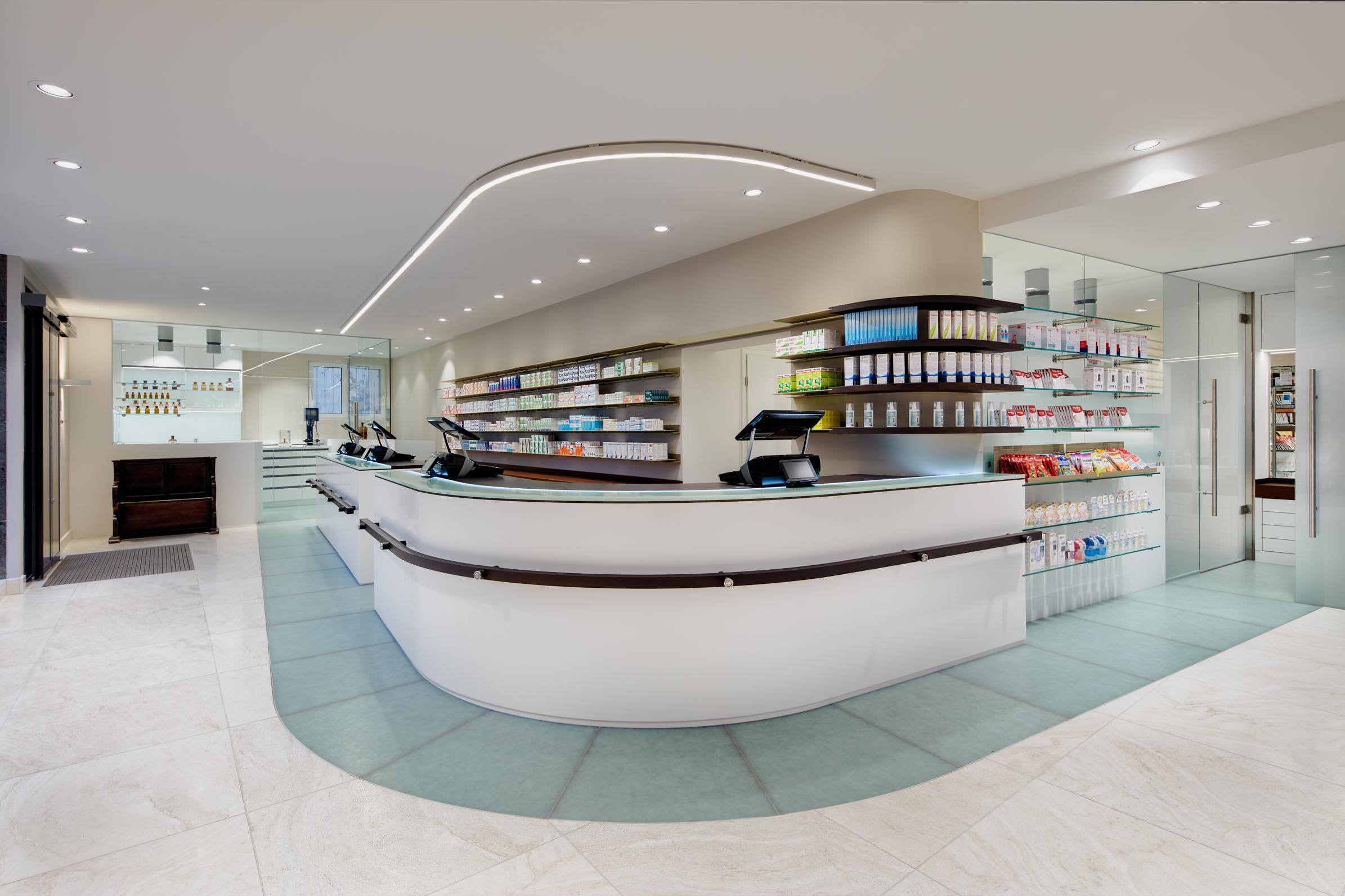
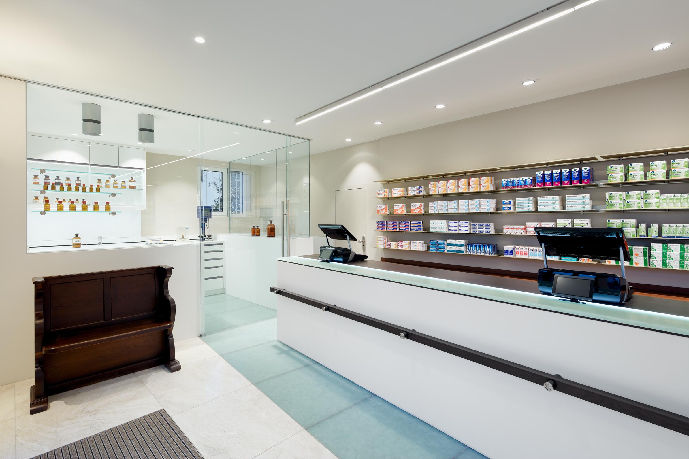
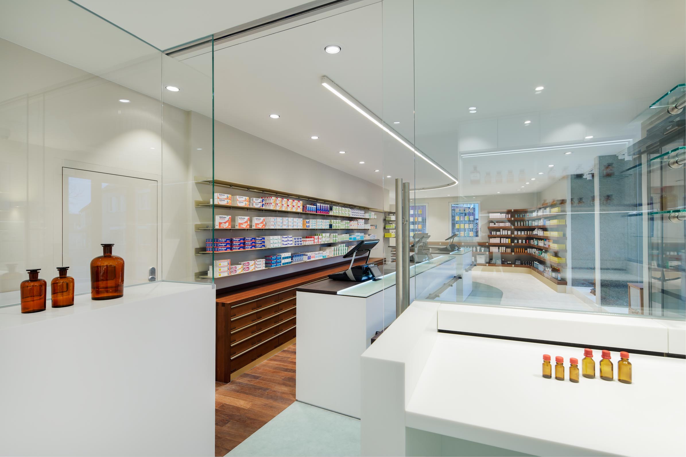
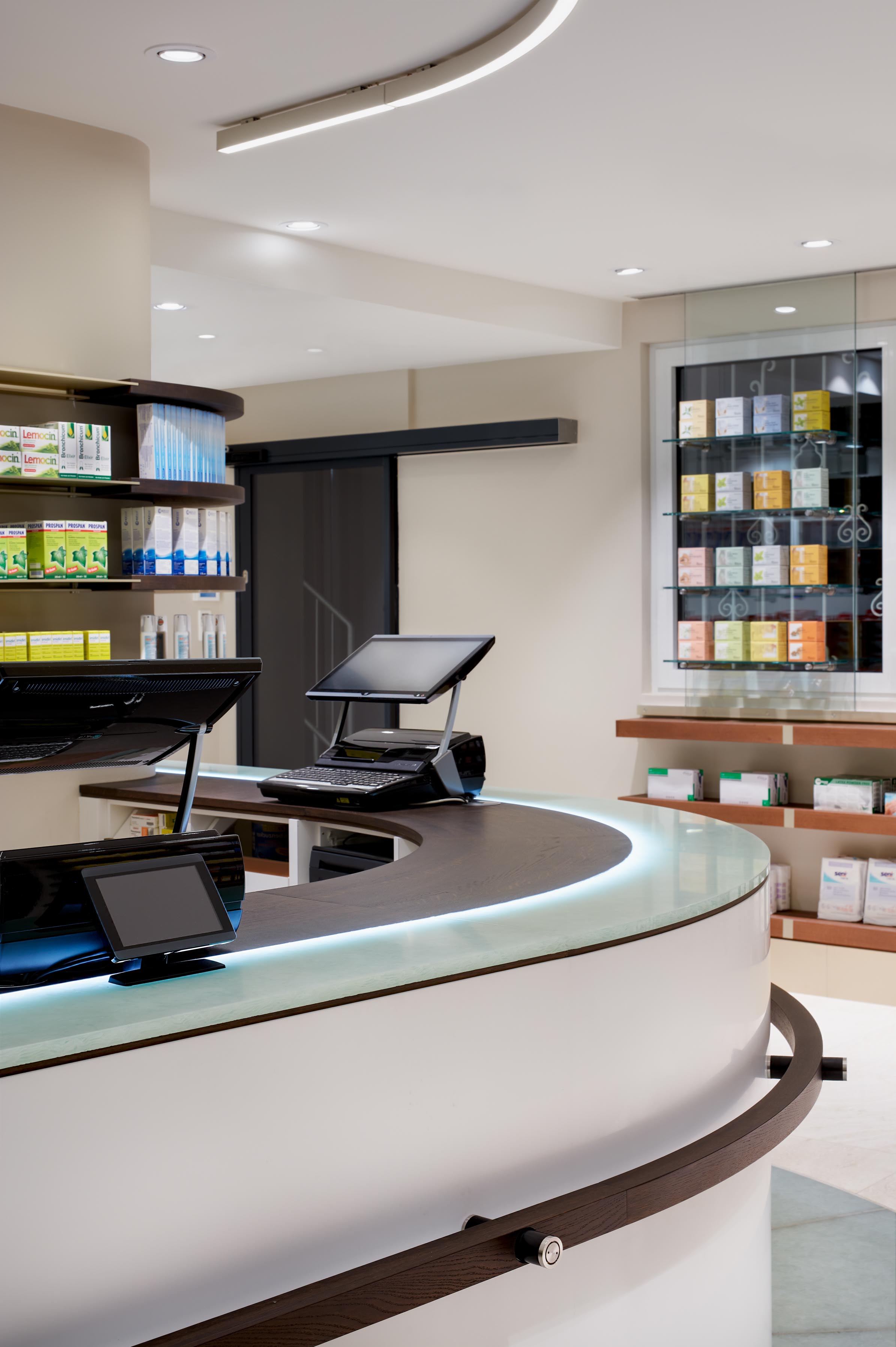
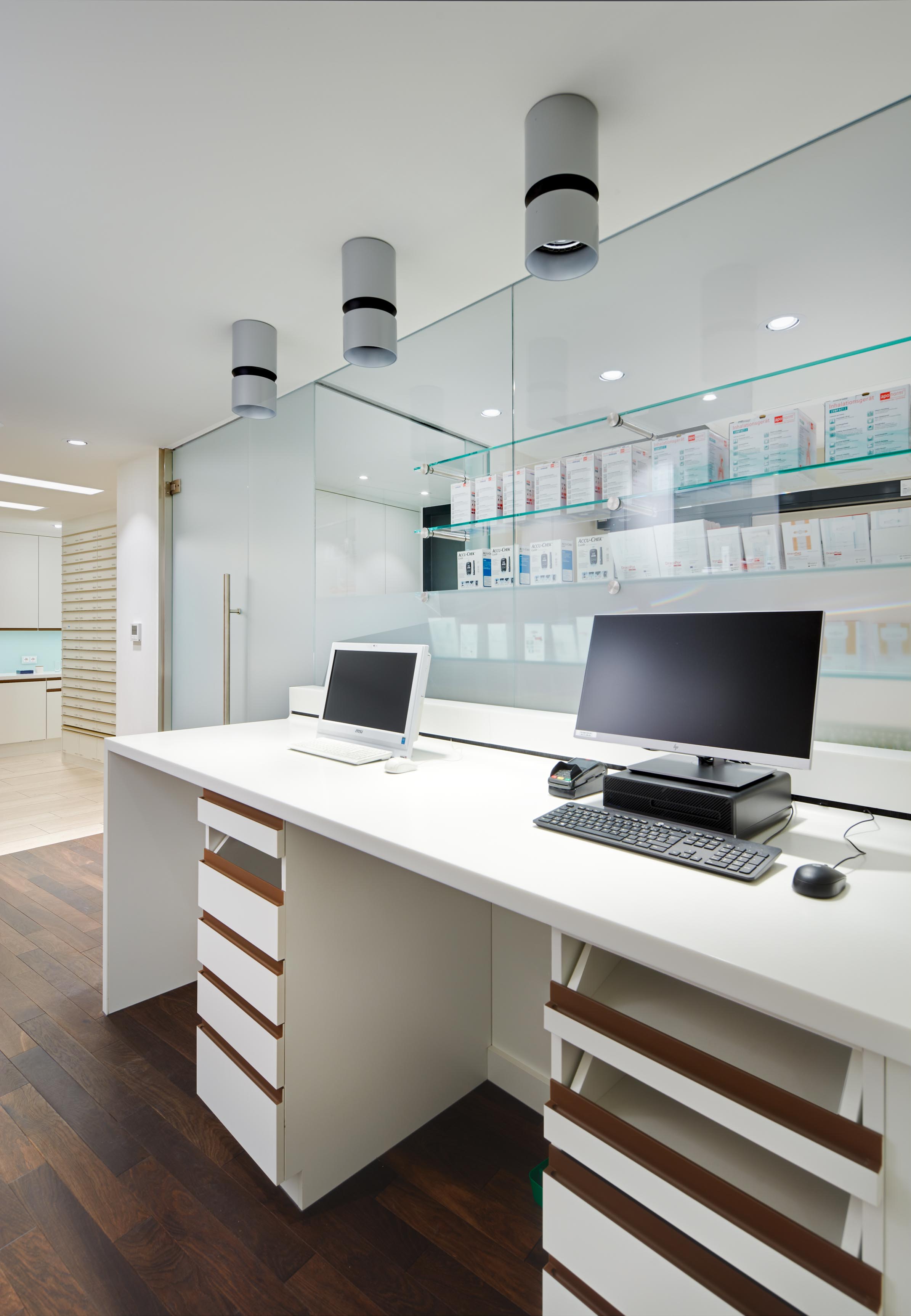
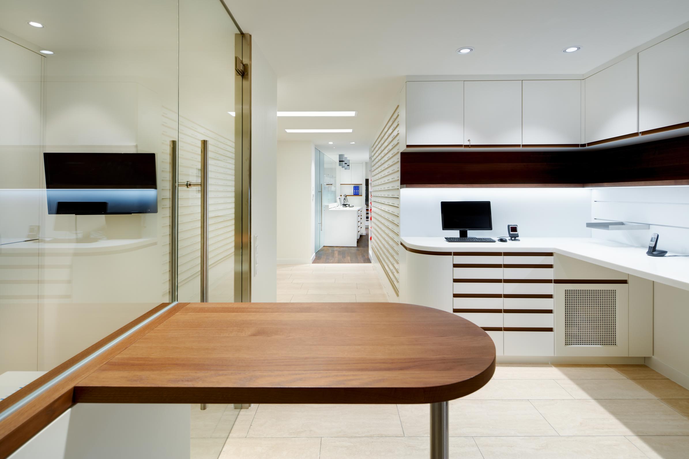
Because the two entrances are positioned on different exterior walls, the dispensary has an L-shaped floor plan. To immediately communicate that the space continues around the corner, the prescription counter was designed as a sweeping curved element.
A continuous ceiling light and a matching curved inlay of durable glass ceramic embedded in the floor reinforce this movement. Together they guide visitors naturally through the pharmacy and transform the bend in the floor plan into a defining architectural gesture.
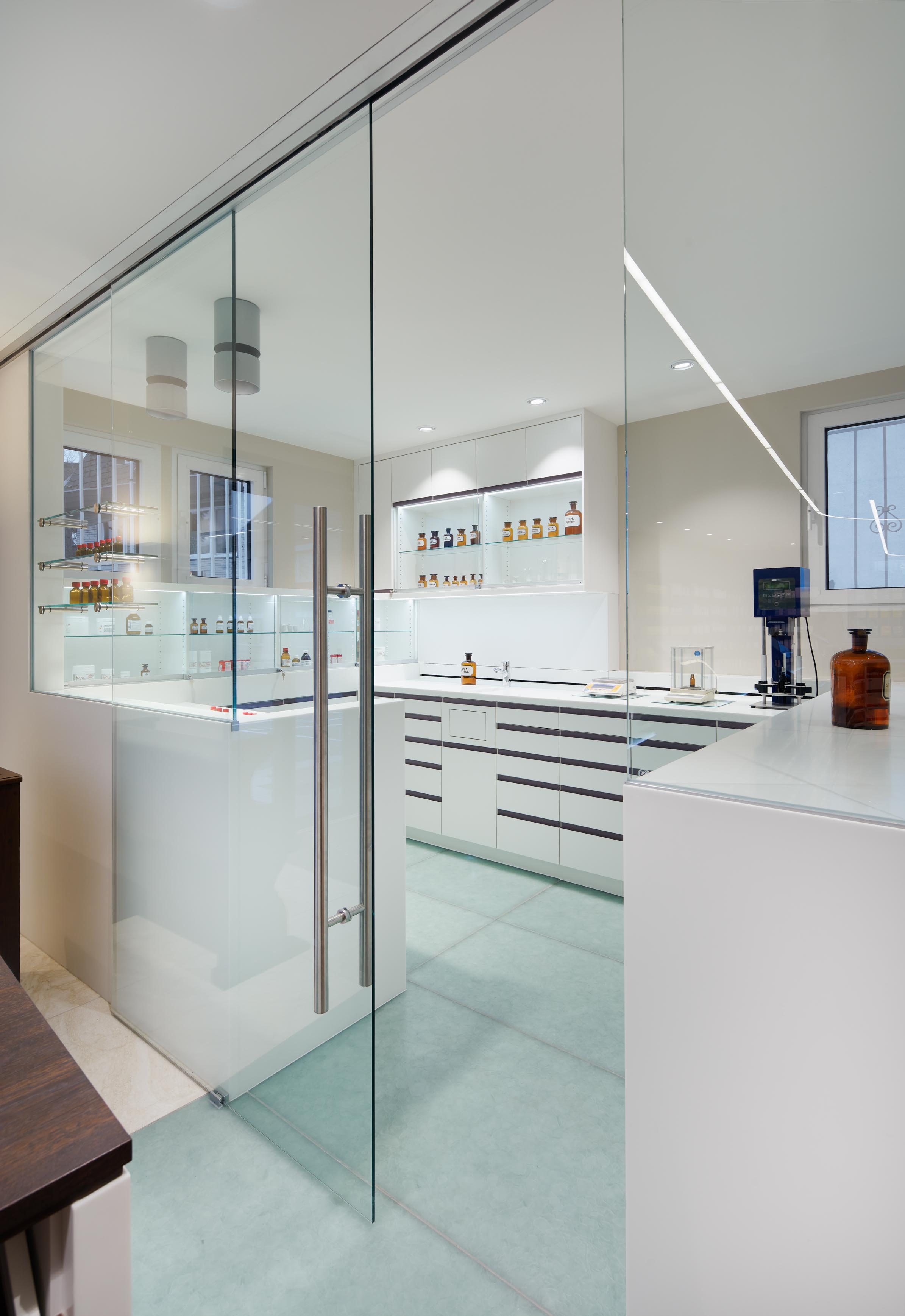
At each end of the layout are the compounding laboratory and the consultation room. The flooring that accompanies the counter widens into both spaces, visually integrating them into the overall design.
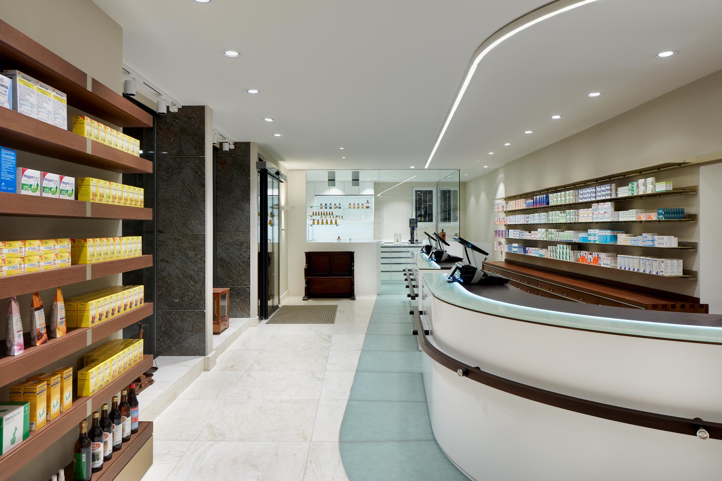
Self-Service, Medicine Display and Quality of Stay
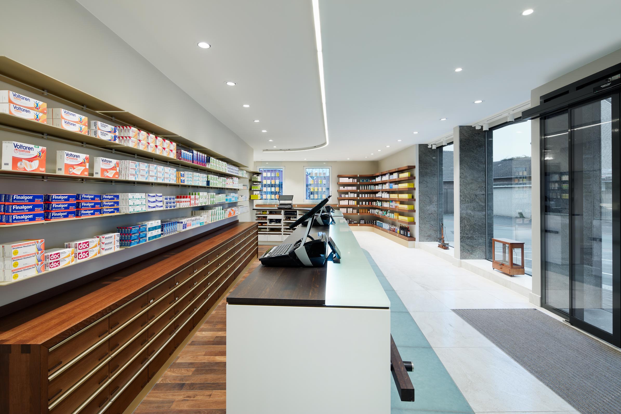
The dispensary is more than a retail space; it is a place for orientation and consultation. The self-service area, medicine display and prescription counter were carefully arranged so visitors intuitively understand the space while staff benefit from efficient and direct workflows.
The design remains calm and understated. Nothing appears forced or overly expressive. Instead, the result is an interior that feels warm, welcoming and functionally precise.

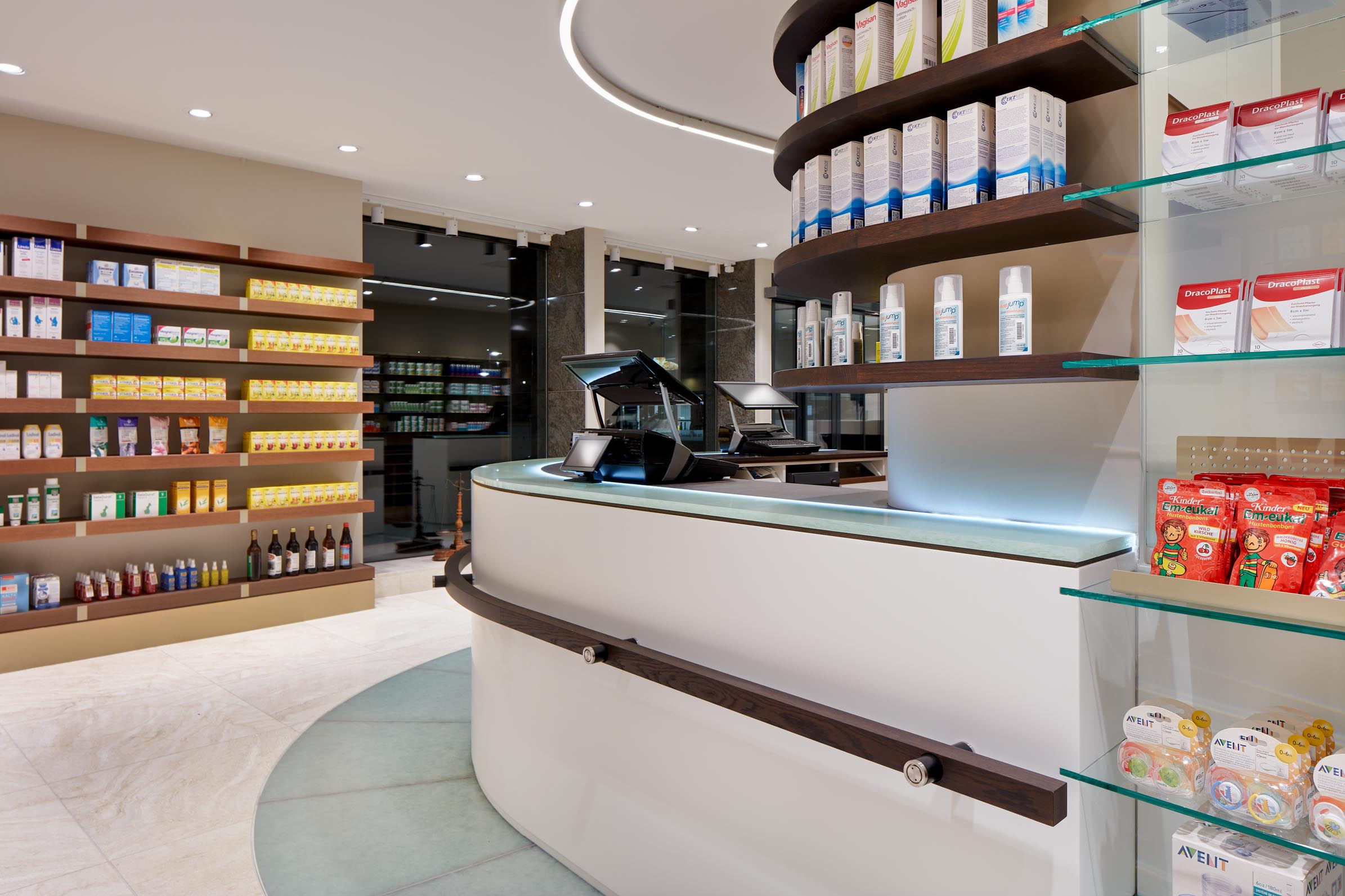
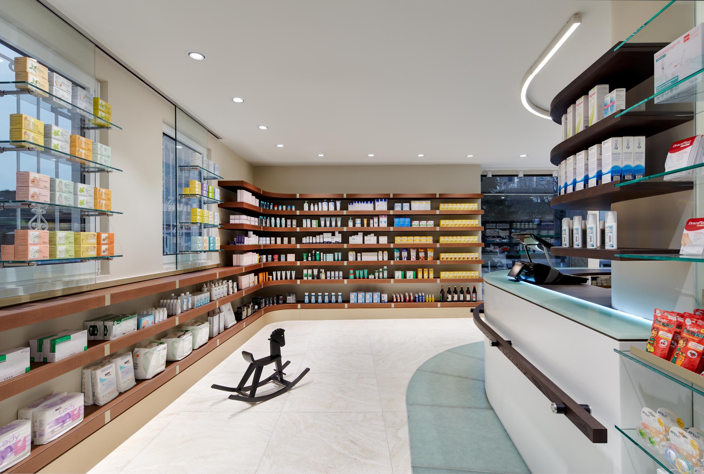
“Marienschein”
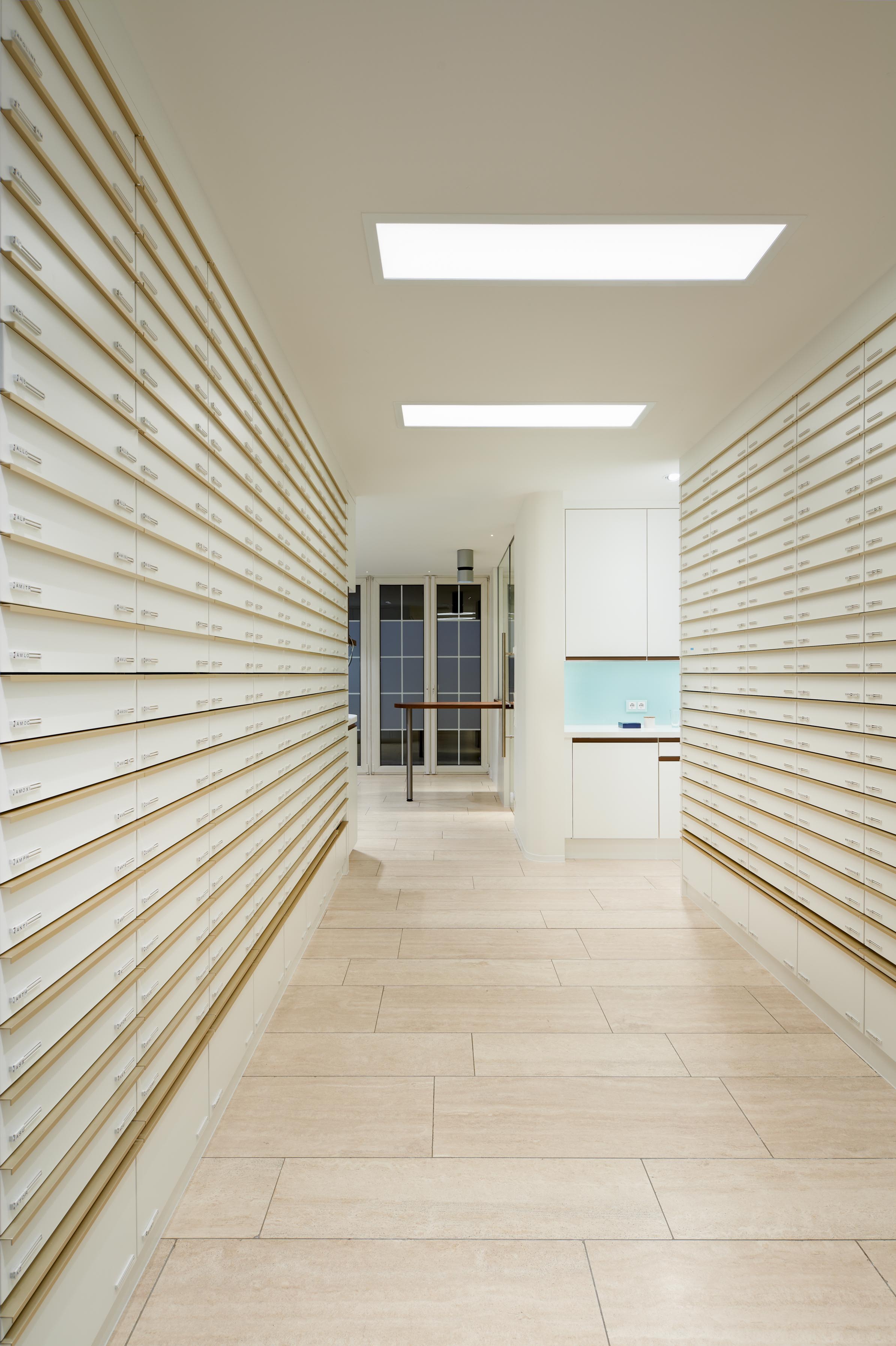
The overall atmosphere is defined by warm cream and beige tones. Travertine flooring, light-coloured walls and generous lighting create an inviting environment.
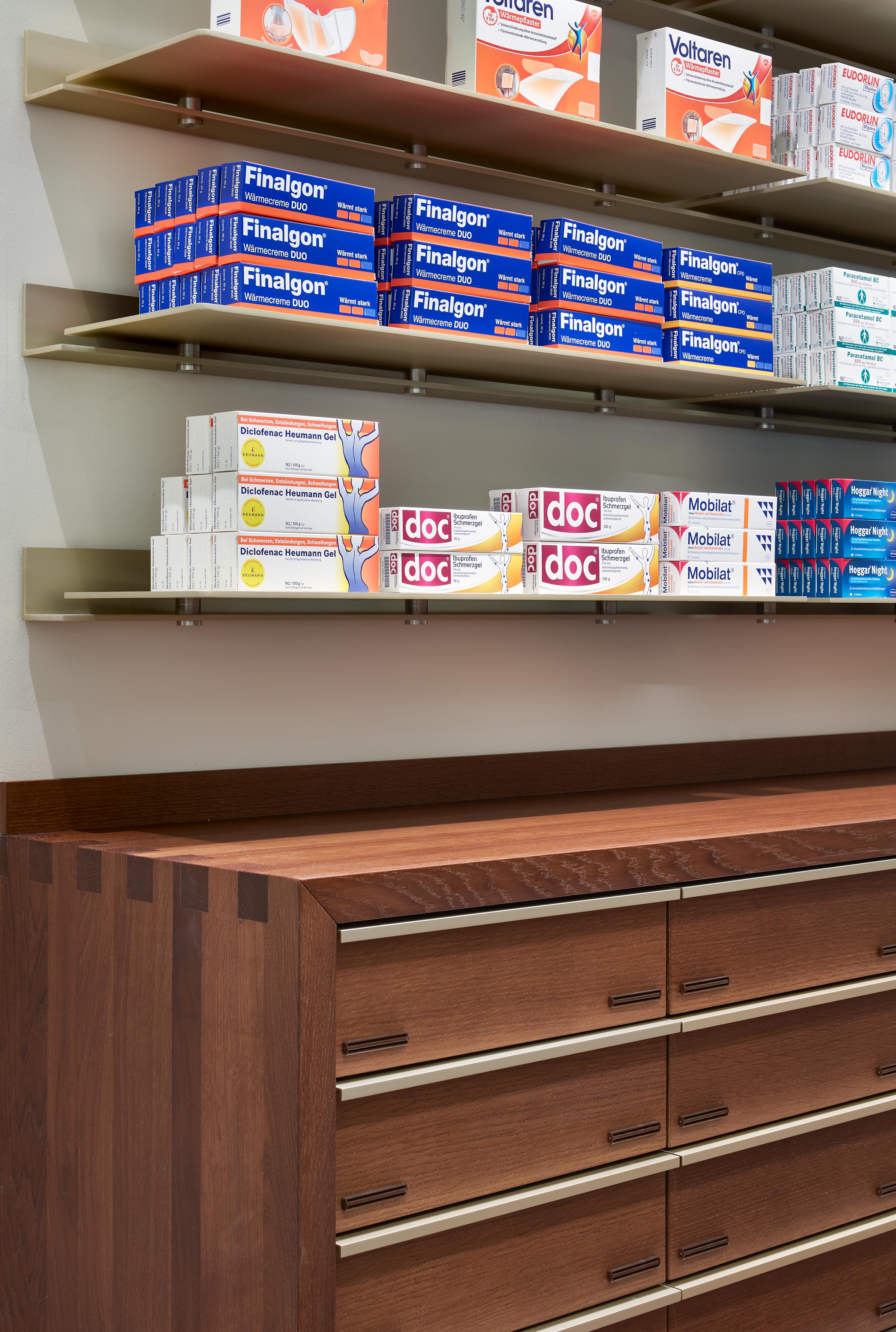
Smoked oak on the prescription counter and fast-moving product drawers creates a warm contrast. Gold anodised aluminium shelves appear to float above the drawer units like a subtle halo of light, giving the project its distinctive character.
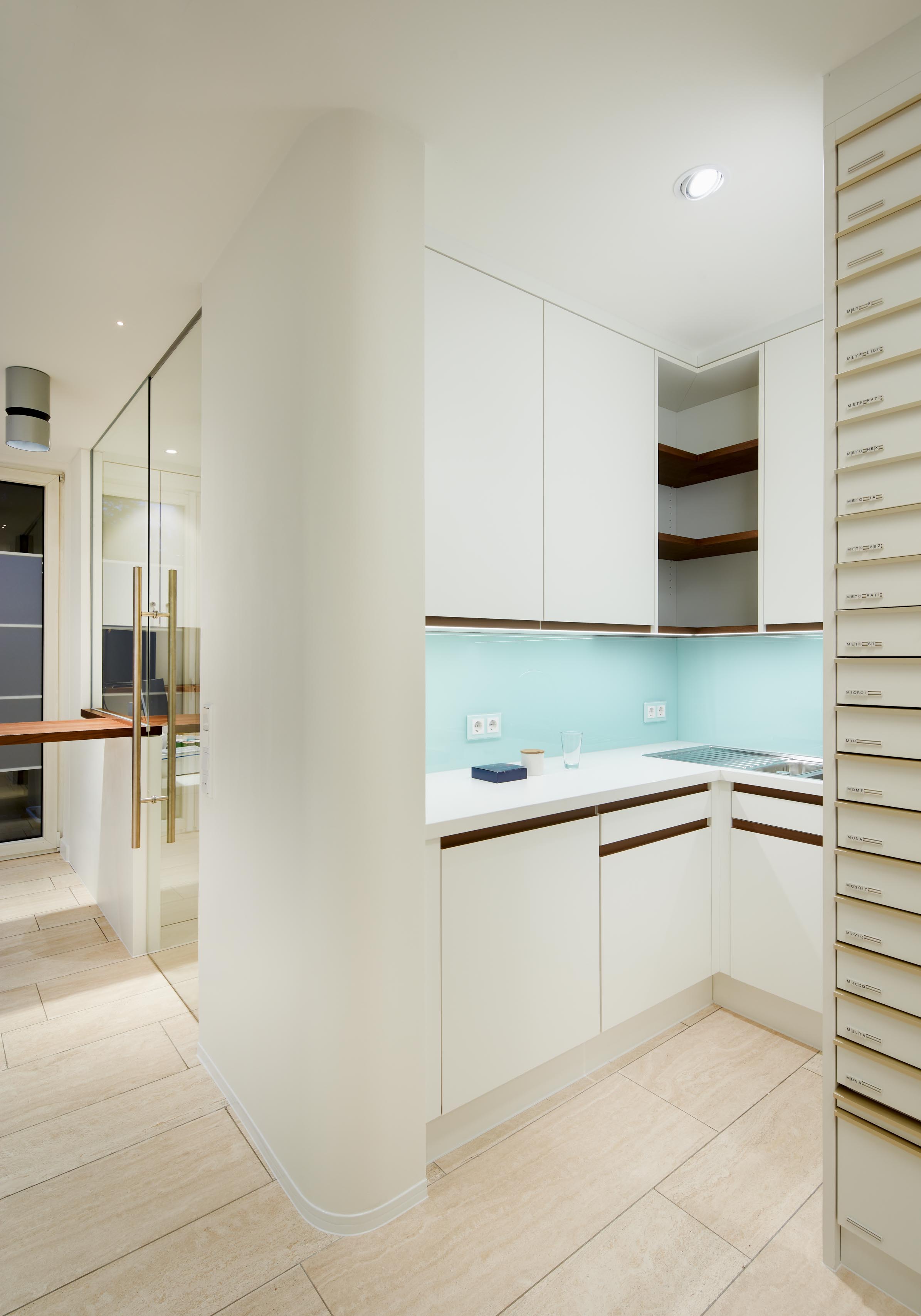
The pale turquoise glass ceramic incorporated into both the counter and the floor introduces freshness and visual coolness. Combined with travertine, oak and gold anodised aluminium, the result is a pharmacy that feels timeless, independent and quietly elegant.
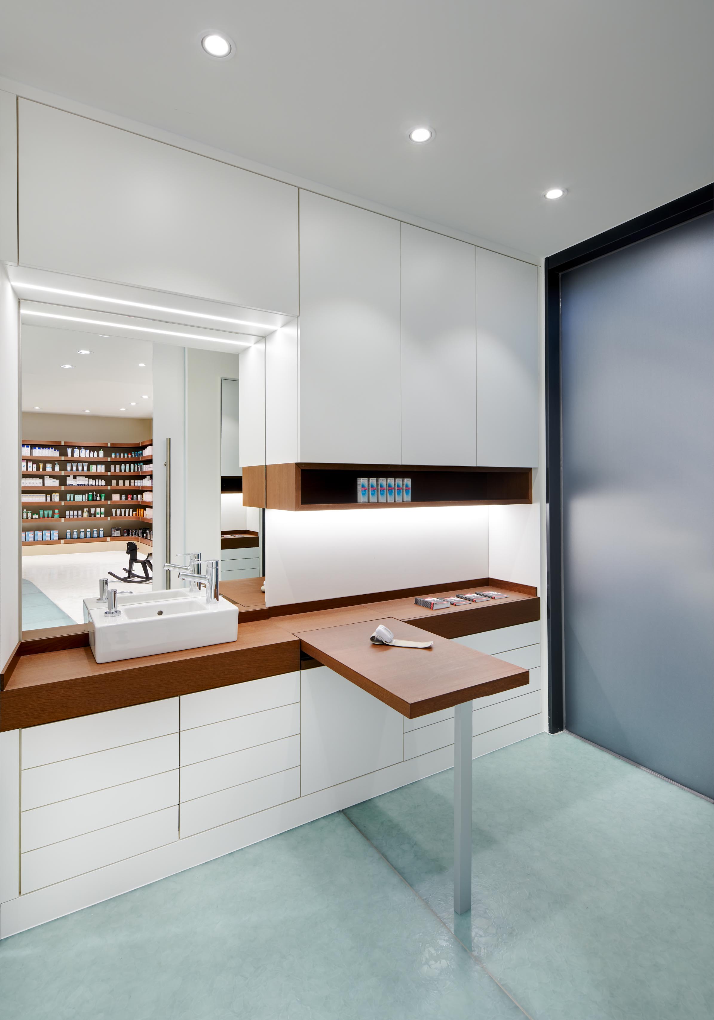
Back Office and Staff Areas
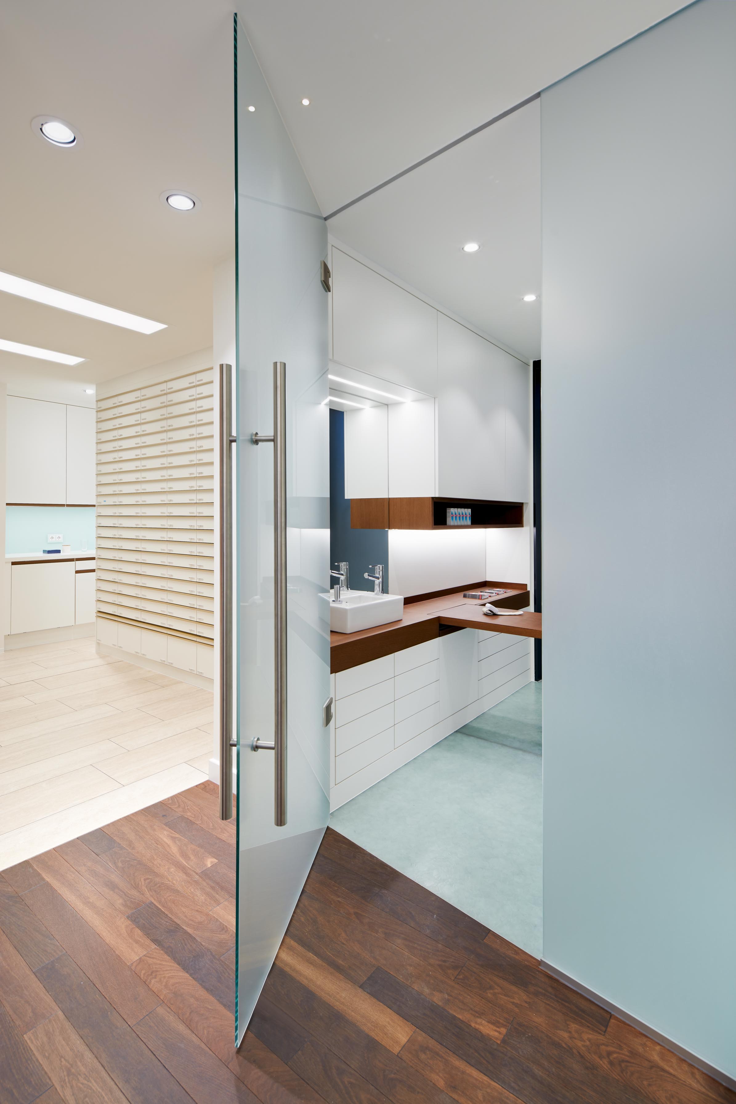
The staff areas were treated as an integral part of the overall concept. The back office, drawer columns and kitchenette are not secondary spaces but essential components of a pharmacy designed to function efficiently every day.
Reorganising these operational areas created shorter routes, improved workflows and a more pleasant working environment for the pharmacy team.
Before and After
If you would like to see how the pharmacy looked before the refurbishment, click here.
Further References
More projects, detailed photographs and references relating to pharmacy design can be found on our Pinterest board:
Pinterest Board “Pharmacy Design”
Project Details
- Project: Marien Pharmacy
- Address: Marienstraße 1, 52457 Aldenhoven, Germany
- Design: Klaus Bürger
- Refurbishment: 2020
- Total area: 165 m²
- Client: Pharmacist Natalie Nowak
We do not plan pharmacies. We create one-of-a-kind spaces.
Every project has its own story, its own requirements and its own personality. That is why we do not believe in standard solutions.
Should you wish to discuss your own project, we would be delighted to hear from you.
Phone: 02151 736005
Email: k.buerger@k-buerger.de